
Hospitality Branding: The Visual Language that Turns First-Time Guests Into Regulars
Hospitality Branding: The Visual Language that Turns
First-Time Guests Into Regulars
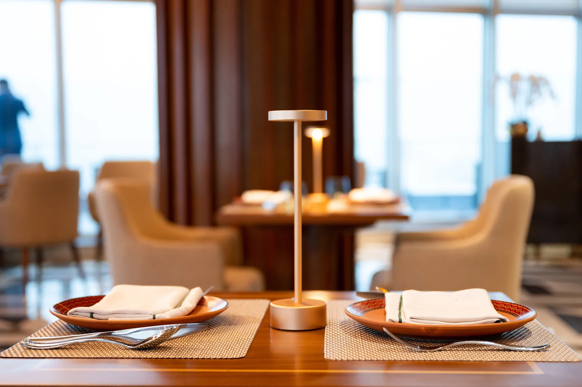
Is there's a restaurant that you keep going back to? Not because it's the closest, and not because the menu changes dramatically. Do you go back because every time you’re there, something clicks into place ? Perhaps it’s the way the light hits the bar, or how the weight of the menu feels in your hands, or maybe it’s the font on the chalkboard. None of it is accidental. None of it is particularly loud. But it all says the same thing, in the same voice, every single time. That's hospitality branding working exactly the way it should.
And here's what's interesting: most restaurant owners are thinking about branding backwards. They're asking "How do we look better?" when the real question is "How do we make guests feel like they've found their place?" Those are different problems, and they require different solutions.
What "Visual Language" Actually Means
Let's clear up a term that gets used loosely. When designers talk about visual language, they are referring to a complete vocabulary of visual decisions — typefaces, color, proportion, texture, negative space, imagery. All those elements is what a brand uses consistently across every surface. It’s not just a logo or a color palette on a mood board. It’s a visual system, emphasis on the keyword, system.
The best hospitality brands — whether that's a neighborhood café or a destination restaurant — are not the ones with the most beautiful menus or the most polished Instagram grids. They're the ones where every visual decision comes from the same source. The typeface on the signage and the typeface on the to-go cup belong to the same family. The warm cream of the dining room walls and the warm cream of the website background are not coincidentally similar — someone made sure they were the same. When that consistency is present, guests don't consciously notice it. They feel it as coherence, as intention, as trust.
When it's absent — when the menu font doesn't match the website, when the Instagram feels like a different restaurant than the dining room — guests feel that too. Only thing is that they probably can't name it or put their finger on it. It registers as something slightly off, slightly unfinished. And "slightly unfinished" is not the feeling that converts first-time visitors into regulars.
The Five Places Your Visual System Either Builds or Breaks Trust
There is no single touchpoint that does all the work. Hospitality branding lives and dies by accumulation — the micro-impressions that stack up before, during, and after the meal. Here are the five where the visual system is doing the most work, often invisibly.
1. Your Digital Presence, Before They Arrive
The first impression is almost never found in your dining room. It's found on your website, your Google listing, or a photo someone shared. By the time a new guest is considering you, they've already made at least one visual judgment.
For a café or restaurant owner who wants to feel more established, this is where the gap tends to be most visible. A dining room that feels considered, warm, and particular — and a website that looks like it was assembled in an afternoon — sends a signal. Not that the food is bad. But that no one is in charge of the story.
Your website's visual language should feel like walking through the front door of your restaurant, not like opening a generic template.
(Read more on restaurant websites and how I handle them)
2. The Menu (Which Most Restaurants Treat as an Afterthought)
The menu is probably the most-handled piece of branded material in any restaurant. Every guest touches it. Many guests study it for several minutes. And yet it's routinely the last thing to receive serious design attention.
A well-designed menu isn't about visual spectacle. It's about hierarchy — guiding the eye so the guest finds what they're looking for without friction. It's about typeface choices that match the personality of the restaurant. It's about the relationship between section headers and item names and descriptions, so nothing fights for attention and everything feels like it belongs.
When the menu feels like the same restaurant as the website and the signage, something important happens: the guest relaxes. They're in the right place. That ease is the emotional foundation of a return visit.
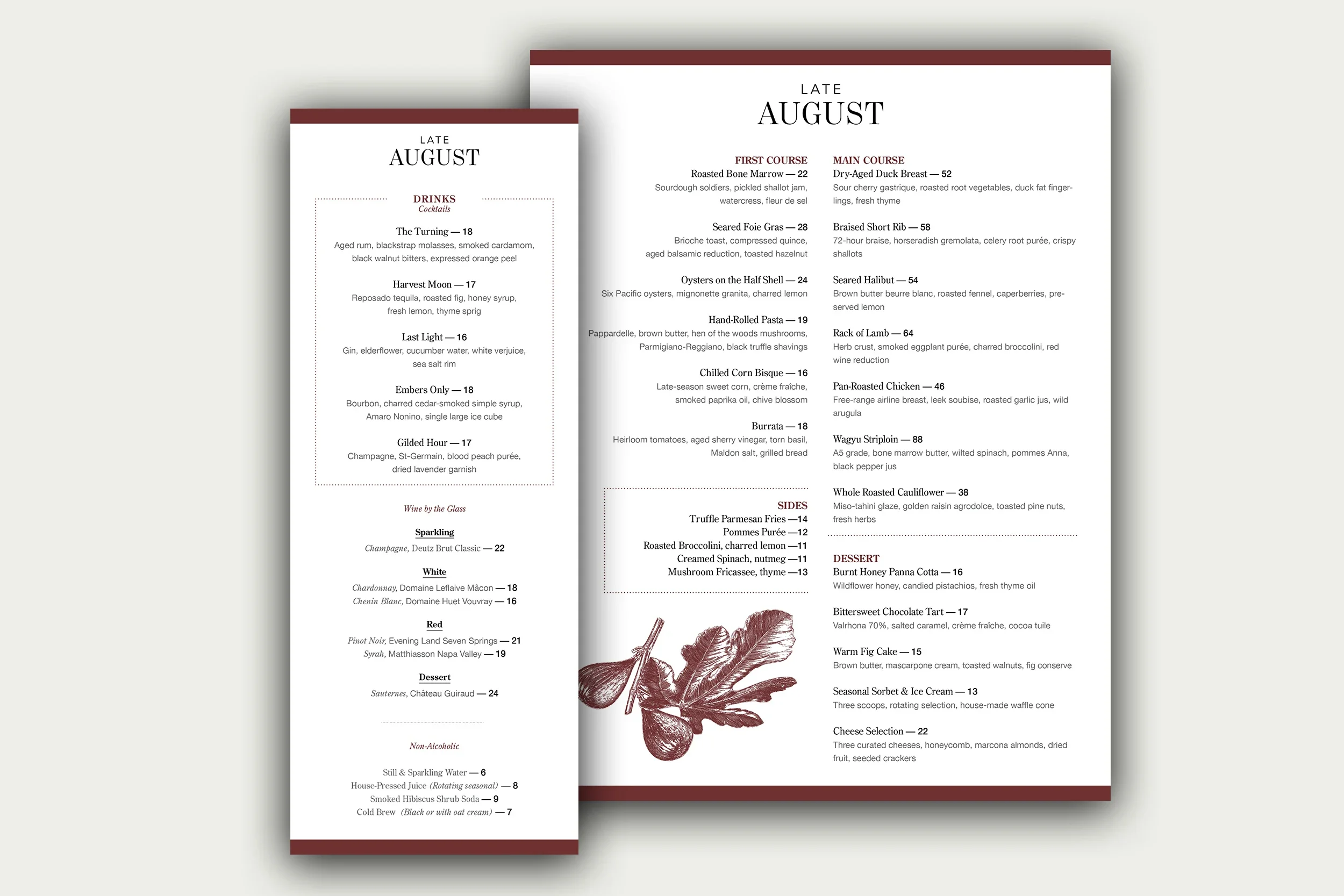
An example of a menu I designed as a case study restaurant called Late August. Notice the typography is consistent throughout along with the color palette and the layout. Late August is a high-end restaurant and an elegant serif font was selected for the logo in addition to all of the titles (names of plates and drinks). When you see this, you know you’re paying for a quality dining experience.
3. The Physical Environment
The dining room itself is a brand surface — the typeface on the chalkboard, the labels on the condiment bottles, the design of the check presenter. Most restaurants think about the interior in terms of aesthetics. The better question is: does the interior speak the same visual language as everything else?
Consider what happens when a restaurant with a warm, hand-drawn logo and a casual, neighborhood feel has a dining room full of sleek, cold fixtures and minimal lighting. The mismatch creates dissonance. Guests feel it as a slight inconsistency in the experience, even if they can't point to why.
The restaurants that build the strongest loyalty tend to have environments where every element — material, light, typography, color — seems to have been chosen with the same eye. Not necessarily a big budget. An intentional one.
4. Social Media (Where Consistency Most Often Falls Apart)
Social media is where brand consistency goes to die. It's updated frequently, often by different people, and almost always under time pressure. The result, in most restaurants, is a feed that looks like a collage from four different businesses: polished professional photography next to phone snapshots, brand colors one week and completely different tones the next.
The problem isn't that any individual post is bad. It's that the cumulative impression is incoherence. And incoherence doesn't build the kind of familiarity that drives return visits.
The fix isn't perfection — it's a short, documented visual standard. The same filters or editing presets. The same ratio of plate shots to room shots to lifestyle imagery. Fonts applied to story graphics that match your menu. Small decisions, made once, applied consistently.
5. Packaging and the Moment After the Meal
To-go packaging, take-home cards, receipts, loyalty cards — these are the pieces of your brand that literally walk out the door. They're also almost universally treated as afterthoughts, probably ordered from a generic supplier with a logo slapped on.
The restaurants that turn first-time guests into regulars understand that the brand experience doesn't end when the guest leaves. A beautifully designed to-go bag tells the person carrying it that the restaurant takes itself seriously. It becomes a small, quiet advertisement — and it extends the feeling of the meal into the guest's day.
Why Consistency Builds Emotional Loyalty (Not Just Recognition)
Here's the insight that shifts how you think about all of this: visual consistency doesn't just make a brand recognizable, it makes it reliable. And reliability is one of the core ingredients in emotional loyalty. When a guest returns to a restaurant, they're not just returning for the food. They're returning for a feeling they've been promised — the feeling that the place delivers on its personality every single time. When the visual language is consistent, every visit reinforces that promise. The guest knows what they're walking into. And knowing what to expect is, for most people, deeply comforting.
This is why the best hospitality brands invest in design systems rather than one-off projects. A logo is a single asset. A visual system is the infrastructure that makes every future decision faster, cheaper, and more coherent. It's what allows a restaurant to expand its menu, update its website, and launch a new event series — and still feel like the same restaurant.
What This Looks Like in Practice
If you're a café or restaurant owner reading this and feeling the gap between where your brand is and where it should be, here's a practical framework for thinking about it.
Start with an honest inventory.
Pull up your website, your menu, your Instagram profile, and any printed materials side by side. Do they look like the same restaurant? Do they use the same type family? The same color story? The same overall mood? If the answer is mostly no, you have a consistency problem — not a design problem. The distinction matters, because consistency can be built without starting over.
Identify your anchor elements.
Every brand system has two or three elements that do most of the heavy lifting: a primary typeface, a color palette, a photographic style. Figure out what yours are — or what they should be — and commit to them. Everything else is built around these anchors.
Fix the highest-traffic touchpoints first.
Not everything needs to be redesigned at once. Prioritize the surfaces that the most people encounter before they've ever been to your restaurant — the website, the Google listing, the Instagram profile. These are the places where your visual language is either earning trust or quietly losing it.
Document the decisions.
A brand system is only useful if the people maintaining it can apply it consistently. Even a one-page document that says, “Here are our fonts, here are our colors, and here's how we edit photos “, is enough to align a small team and prevent the gradual drift that happens when no one is keeping track.
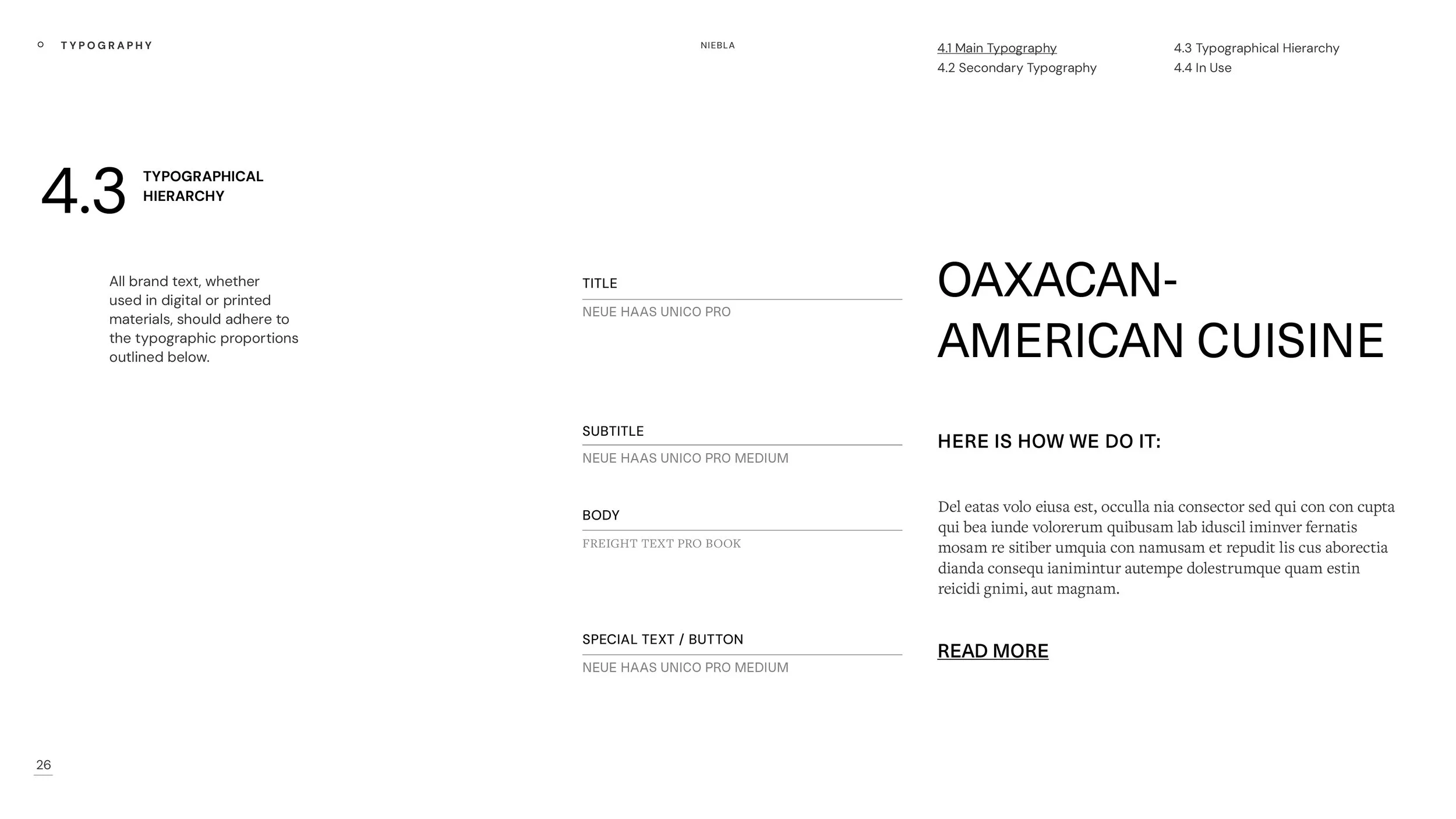
An example of a typography branding guidelines for my concept project, Niebla. Here I share what fonts I use and where I use them to keep the brand and messaging consistent.
The Pattern Underneath All of This
The restaurants that build real loyalty — the ones with regulars who show up without an occasion, who bring friends, who feel a sense of ownership over the place — are almost never the ones with the biggest budgets. They're the ones where someone made intentional decisions about what the restaurant looks and feels like, and then held that line across every surface.
Visual language is the system those decisions live in. When it's working, guests don't notice the design — they just feel at home. And feeling at home is how a first-time visitor becomes someone who's been coming every Sunday for three years.
That's what branding is actually for.
If your restaurant's visual presence feels inconsistent — or like it doesn't quite match the experience you're actually delivering — a Brand Clarity Audit is a good place to start. It's a structured review of everything a guest sees before they walk through your door, with a clear map of what to fix and in what order. Download your audit here.
