
What Makes Great Restaurant Web Design in 2026
What Makes a Great Restaurant
Website Design in 2026 (and what gets in the way)
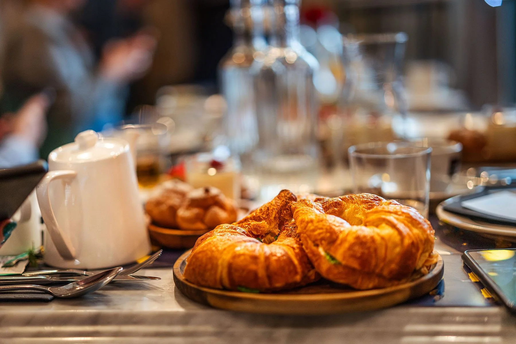
Have you ever landed on a restaurant's website before, spent thirty seconds on it, and then left? It’s not because the food didn't look good or because the hours were wrong, but because something felt off — cluttered, confusing, or just unconvincing. I don’t know about you but if it makes no sense to me, visually, I can’t process it. So you find yourself there, looking at this confusing website and finally decided to just move on to the next result.
Now let’s look at that from the other side of the coin: you are the restaurant owner. That was a potential customer who just left your website and booked somewhere else. Restaurant website design isn't a digital menu stand. It's your first impression, your reservation funnel, and your private events sales page — all in one. When that works, people book. When it doesn't, they don't, and you'll never know why.
As a restaurant and hospitality brand designer, I've seen the same patterns come up frequently — both the things that work and the things that quietly cost restaurants money. Here are seven of them.
1. The Menu Is a PDF(and that is a problem)
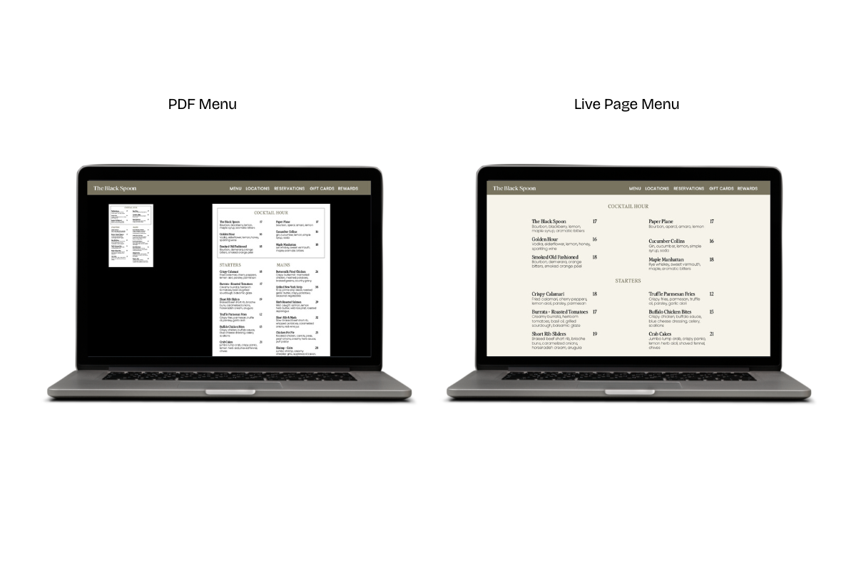
This is a very common mistake I see on restaurant websites and most owners have no idea it matters beyond convenience. When your menu lives as a PDF, it's invisible to Google, meaning search engines can't read inside PDF files the way they crawl (read) a regular web page. So every dish name, every ingredient, every descriptor — "wood-fired lamb with salsa macha," "hibiscus margarita with mezcal float" — none of it is doing any SEO work for you. You're sitting on a goldmine of searchable content and locking it in a file no one can index.
A live menu page (check out Girl and the Goat for a good example) — built with regular text, the same way any other page on your site is built — changes that. Google can crawl it. Your dishes can show up in search results. And on mobile, your customers aren't zooming into a PDF trying to read your font at 60% and then having your device suddendly zoom you out (it has happened to the best of us).
The fix is straightforward: build your menu as a native page on your website. Style it well, organize it clearly, and treat it like the content it is.
2. The Homepage Photo is Doing the Wrong Job
Most restaurant websites open with a wide dining room shot, a flat lay of dishes, or a generic food photo that could belong to any restaurant anywhere. And while those images might be beautiful, beautiful isn't enough.
Your hero image has one job: to tell the right person that this place is for them. A date-night restaurant should feel intimate, warm, a little cinematic — the kind of image that makes someone think yes, that's the kind of night I want. A fast-casual lunch spot should feel bright, efficient, and inviting — easy energy with no fuss. A high end restaurant should make you feel like you’re being transported somewhere with a point of view (check out Eleven Madison Park to see their gallery of images on their homepage that shows how unique this restaurant really is)
When the image and the customer's intention don't match within the first few seconds of landing on your site, they leave. Not because they made a conscious decision — but because something didn't click. The photo shouldn’t be treated as decoration. It should be treated as positioning.
3. There's No Friction-Free Path to the Reservation
Think about the last time you tried to book a table on your phone. How many taps did it take to find the reservation button? Was it in the navigation bar, competing for attention with five other links? Did you have to scroll back to the top of the page to find it after reading the about section?
Every extra tap is friction. Friction causes frustration, and frustration loses reservations. The reservation CTA (call to action) — whether it's a "Book a Table" button or a direct link to OpenTable, Tock, or Resy — should be persistent. That means that it should be found in your navigation and that navigation should stay visible as you scroll down the page. This is called a sticky header, and it's exactly what it sounds like: the top bar of your website sticks to the top of the screen as you move down. The button never disappears.
On mobile, this matters even more. Most people searching for a restaurant on their phone are making a decision in the moment. If they have to hunt for the booking link, you've already lost some of them.

4. The About Page Is a Founding Story, Not a Trust-Builder
"We opened in 2015 with a dream of bringing authentic flavors to our community." Sound familiar? It's on half the restaurant about pages on the internet, and it tells a visitor almost nothing useful. The about page's actual job is to answer one question: is this place right for me? Who is the chef, and what is their background? What does a meal here actually feel like — what's the energy, the pacing, the kind of occasion it's suited for? Is this somewhere to bring clients, your parents, or a first date?
This matters especially for private events. Corporate planners and event coordinators almost always check the about page before making an inquiry. If it reads like a press release no one asked for, that inquiry doesn't happen. If it reads like a real introduction to the people and the philosophy behind the restaurant, it builds the trust that makes someone pick up the phone.
5. The Contact Information Isn't Actually Functional on Mobile
What about this scenario: someone finds your restaurant on their phone while they're already out. They want your address to pull up in Maps and they want to call ahead. They also want to confirm that you're open. Standard practice is to have this information in two places: the footer (on every page) and a dedicated “Contact” or “Visit Us” page. Most restaurants have both. The problem is that having the information and having it work on mobile are two different things.
Is the address a tappable link that opens up in Google Maps? If it does, this saves your customer valuable time. Is the phone number formatted as a clickable call link as well? Because nobody wants to write the number down to make that phone call, or worse yet, keep tapping back and forth between the “Contact” page and your phone screen. Are the hours readable at a small size, and are they actually current (this is a big one—how frustrating is it when you think a restaurant opens at a certain time only to find out, in person, that they’re not?)?
These feel like small details. But most restaurant searches happen on a phone, often in the moment when someone is deciding right now where to go. If the friction is real — if tapping the address does nothing, if the phone number is an image — some of those people move on to the next option. Fix the basics and make sure they actually function the way a mobile user expects.
6. Private Dining Is Treated Like a Feature, Not a Separate Business
This one costs restaurants significant revenue, and it's almost always invisible to the owner.
Most restaurant websites treat private dining as a bullet point — maybe a paragraph buried under a "More" dropdown, or a nav link that leads to a page that says "We host private events! Contact us for details." That's not a private dining page. That's an afterthought.
The customer looking to book a private dinner for twenty people is not the same customer who is deciding where to go for Tuesday night tacos. They have a longer decision timeline, a higher budget, and a specific set of questions they need answered before they'll make an inquiry: How many people does the space hold? What does the room look like? What are the menu options? Is there a minimum spend? How far in advance do I need to book?
A well-built private dining section answers all of those questions before they have to ask. Take a look at how Gramercy Tavern handles this very question. They have Private Dining as a top-level navigation item, which then opens into a section with separate pages for each space. Each space comes with capacity details, room descriptions, what's customizable for the room, and a dedicated inquiry path. Their Even Kit page even specifies deposit requirements. That level of specificity does sales work. A planner can qualify the space without picking up the phone.
When private dining gets its own lane, such as its own navigation item, its own pages, its own inquiry form — it signals that the restaurant takes that revenue stream seriously. And it converts at a completely different rate than a single paragraph with a phone number.
7. The Typography Is Working Against the Brand
This is the one most people don't notice consciously — but they can probably feel it. A couple of examples are a fine dining restaurant that uses a decorative script font that becomes illegible at small sizes, a neighborhood bistro with a default Squarespace system font that makes every page feel like a terms-of-service agreement (building in your brand fonts makes a huge difference), or a modern concept mixing three different typefaces with no hierarchy logic between them.
Typography is the voice of your brand even when no one is speaking. It signals what kind of place you are before anyone reads a single word. When it's inconsistent, generic, or simply wrong for the concept, it undermines everything else — the photography, the copy, the positioning. The food might be exceptional, but the site feels like it doesn't know what it is.
Getting typography right doesn't mean being precious about it. It means choosing fonts that match the personality of the restaurant, maintaining hierarchy so the reader knows where to look, and making sure everything is readable on a phone. It's not a minor detail — it's what separates a site that feels considered from one that feels assembled.
The Pattern Underneath All of This
If there's a common thread in all seven of these and it's this: the best restaurant websites are built around how a customer actually thinks and moves — not around how a restaurant is organized internally.
The customer looking for a Friday night reservation doesn't think in navigation categories. The event planner researching private dining spaces doesn't have time to hunt. The person on their phone deciding in thirty seconds doesn't have patience for friction. A restaurant website that works is one that makes the right next step obvious for every kind of visitor — every time.
If your restaurant's website isn't converting the way it should, I'd love to take a look. I design Squarespace websites for founder-led restaurants and hospitality brands that are built to do real work — not just look good. [Let's talk →]
