
Why Your Menu Design Is Losing You Money
(and What to Do About It)
Why Your Menu Design Is Losing You Money (and What to Do About It)
Have you ever watched a guest open your menu, glance at it for ten seconds, and then ask the server, “So, what’s good?”
It’s a small moment and it’s easy to miss, but it tells you something. The menu was supposed to answer that question, but it didn’t.
I run a menu design service for restaurants and food brands, and when I look at menus, the same few problems keep showing up. None of them have anything to do with the food. They’re about how the page is built. A page that’s hard to read quietly costs you orders, bigger checks, and the confidence guests need to try something new.
A Menu Is Not a Price List
Here’s the shift that changes how you see your own menu. A menu isn’t a price list. It’s a guide and it’s the one piece of marketing every guest reads. They read it at the exact moment they’re deciding how much to spend. That gives your menu a job. It should help a guest find their section, understand what a dish is, and feel sure enough to order it. When the design does that work, guests decide faster and order with more confidence. When it doesn’t, they retreat to the safest item on the page or they ask the server. And now your server is doing the menu’s job.
Where a Menu Quietly Loses Money
Everything shouts at the same volume.
When every dish name, description, and price is the same size and weight, nothing leads the eye. Guests scan the whole page, get tired, and choose the first thing they recognize. Hierarchy is how you tell them where to look first, second, and third. It isn’t decoration. It’s direction.
Sections blur together.
A menu that runs brunch into dinner, or drinks into entrées, makes guests work to find their part of the page. Anything that takes effort costs you orders. A clear break, whether it’s space, color, or a label, lets a guest find their section in a second.
Too many typefaces, or the wrong ones.
Three or four fonts fighting on one page read as noise, even when a guest can’t say why. Two usually do the job: one with some character for the dish names, and a quieter one for everything else. The type should do its work without announcing itself.
Prices take over the page.
Prices lined up in a column down the right edge, with dot leaders pulling the eye straight to them, turn a menu into a comparison chart. Guests read down the numbers instead of reading about the food. Setting the price quietly after the description lets the dish make its case first.
The menu doesn’t match the room.
A candlelit dining room that hands out a menu that looks like a flyer sends a mixed message. The mismatch registers even if no one says it out loud. Your menu is one touchpoint among many, and it has to agree with the rest of your brand.
Notice that none of these are taste problems. You can have a menu full of beautiful dishes and still lose guests on the page. The fix is rarely more decoration. It’s almost always fewer decisions for the guest to make.
A Teardown: How I Designed Sable + Salt
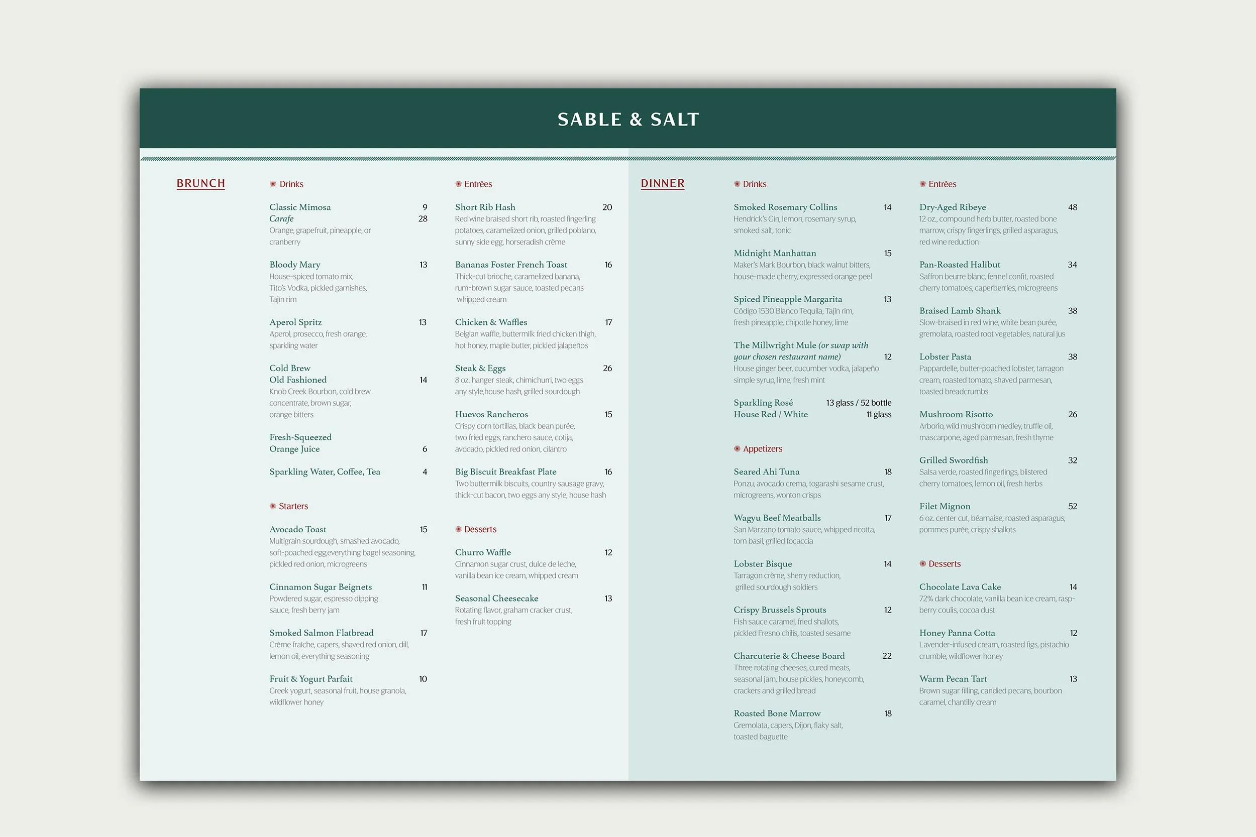
To show you what this looks like in practice, here’s a menu I designed: Sable + Salt, a concept for a casual restaurant that serves both brunch and dinner. Because it’s a concept project and not a client project, I can’t tell you what it earned. I can tell you how it reads and why I made each choice.
Two greens, two services.
The hardest part of a brunch-and-dinner menu is that guests need to know which half is theirs. I gave each service its own shade of green, so before a guest reads a single word, the page has already told them where to look.
Labels that sort instead of shout.
BRUNCH and DINNER are set in all caps and underlined, which makes them the clearest markers on the page. Beneath them, categories like drinks and entrées drop to sentence case with a small starburst glyph. The caps tell you which menu you’re in. The glyph tells you which section. Two levels, two treatments, no confusion.
Two typefaces, each with one job.
Dish names are set in Athletas, which gives them character and keeps the food in front. Section labels and descriptions are set in Figura Sans, a clean sans that keeps the explaining easy to read. One does the talking. The other does the explaining.
Restraint everywhere else.
Color separates, type guides, and everything else stays out of the way. A casual menu doesn’t have to look careless. It can be relaxed and still be organized.
Your menu doesn’t need green and a starburst. It needs the same thinking: a way to tell sections apart, a clear order of importance, and type that stays in its lane. The specific choices change with the room. A fine dining menu asks for restraint and space. A café menu can be looser. The principle doesn’t change: decide what the guest should see first, then design everything else around it.
Audit Your Own Menu in Fifteen Minutes
You don’t need a designer to spot the biggest problems. You need a printed copy of your menu and a few minutes.
Squint at it.
Hold the menu at arm’s length and squint until the text blurs. Whatever still stands out is what your guests see first. Is it your signature dish, or is it a border, a logo, or a price?
Ask someone to find the drinks.
Hand the menu to someone who has never been to your restaurant. If they can’t find a section almost immediately, your sections need clearer breaks.
Count your typefaces.
More than three, and something is probably fighting. Two is usually enough.
Watch where the eye goes on the prices.
If it slides straight down a column of numbers, the prices are doing too much work.
Set it beside your website and your Instagram.
Do they look like the same restaurant? If not, the menu is usually the oldest piece, and the easiest place to start.
When a Menu Design Service Is Worth It
Not every menu needs a designer. If your menu is short, your layout is clear, and guests order without asking questions, leave it alone.
A menu design service is worth it when guests keep asking your servers what to order, when you’re opening a new concept and need print that matches the brand, or when your menu, website, and Instagram look like three different restaurants. In those cases, the page is working against you, and fixing it is usually a smaller investment than living with it.
When I design a menu, I start with the room before the layout: your concept, your guests, and how the menu actually gets used, whether that’s at the table, at the counter, or on a phone. Hierarchy and type come next, and decoration comes last. That order is the whole method.
One more thing. Your menu should also live on your website as real text, not only as a PDF. A PDF is hard to read on a phone and invisible to search. A menu built as a page on your Squarespace site can be read by guests, by Google, and by screen readers.
The Menu Is the Easiest Place to Start
A menu goes into every guest’s hands, every night. It should work as hard as your kitchen does.
If you’re not sure where your menu stands, or whether the menu is even the problem, start with the Brand Clarity Audit. And if you’d like a menu design service built around how guests actually read, I’d love to take a look.
