My Ten Top Serif Fonts I Use in Design
When it comes to choosing the right typeface for a project, serif fonts remain a timeless and versatile option. Known for their elegant details and classic structure, serifs bring a sense of tradition, sophistication, and credibility to any design. Whether you're creating a print publication, branding a boutique business, or building a website with character, serif fonts can help establish visual hierarchy while conveying a refined, trustworthy tone. In this blog post, I’ll share my ten top serif fonts that I use in my design projects.
HIERARCHY IN HEADERS, SUB HEADERS AND BODY COPY
If you’ve read any of my posts then you know I talk about the importance of hierarchy found in typography. Why is this hierarchy important? Because it lets your reader know what parts are important and in the order of said importance. It tells your reader where their eyes should go based on where you have designed for them to go. So, when doing this in layouts such as editorial design or web design, there are three important elements where you will format this hierarchy and they are found in the header, sub header and body.
Your header is also known as the main title of whatever topic you will be covering. In this post, my header is the title you see at the very top. Your sub header can also be called a subtitle. The sub header lets your reader know what you’ll be talking about in that paragraph. And finally, your body copy is (are) the paragraph(s) of text.
When selecting typography, it’s important that you select the right font to go with each one. There are no hard rules per se, as to which you should use, but there are fonts that work better than others and there is a subtle understanding of how to use them. For example, when working with print, I usually pick a sans serif font for headers and sub headers and a serif font for the body copy. Serif fonts are easier to read in print and work well with large bodies of text. With these, your eyes follow along better than with sans serif fonts. Conversely for digital, I tend to use serif fonts for headers and sub headers and sans serif fonts for body copy. Why? Because letters look different on a screen than they do in print and reading a copy done in a serif font is easier on your eyes in a digital layout.
So now that I’ve explained the reasoning behind my methodology, let’s get into my 10 top serif fonts that I use in design projects. I make reference to different parts of letterforms, which is also called the anatomy. To help you understand these parts, the Interaction Design Foundation gives a great visual explanation of the anatomy of letterforms.
FOR HEADERS, SUB HEADERS OR INTRODUCTION TEXT
MONTAGU SLAB
This open-source serif font from Google is one that I recently discovered and absolutely love. I love the look and feel of an old-fashioned typewriter font and this one looks similar. The t’s, a’s and q’s all have that typewriter look that takes me back to my days of typing class in eighth grade (Did I just age myself? I think so). This type of text looks good as a header or sub header in copy because it has letters that stand out in a clean and sophisticated fashion. It’s also a good selection to use in one or two lines of body text, such as something that separates itself from regular body text perhaps found in a pull quote in editorial design. I would also use this font in packaging if the use was minimal but
I would not, however, use this as body copy text. Why? Because it’s a slab font and those aren’t meant for large bodies of text. Because the endings of their letterforms are more acutely defined, it would be difficult to read in a paragraph. Believe it or not, those letters forms make a difference.
This font could also be used in a word mark logo. Word mark logos are just that: words. And a slab font would make an excellent word mark logo.

YORKTEN SLAB
Another slab font, Adobe’s Yorkten is another one I recently discovered that had me swooning over its letter forms. Just like Montagu, this font is an excellent choice for headers, sub headers or short (one to two) lines of text. Because it is a slab font as well, I wouldn’t recommend it for large bodies of text.

MILLER BANNER
Another Adobe font, I like using Miller Banner for my header fonts in Squarespace. For small bodies of text (again, one to two lines, tops), I like the sophisticated look of the descenders and the clean look of the letters at the x-height. As you could see, if I had large bodies of text in the Miller font, the copy would be difficult to read. Banner fonts (or display fonts), just like slab fonts, aren’t meant for large bodies of text for that very reason.

FOR BODY COPY
BASKERVILLE
This is a font that you can easily find and use in Word. Perhaps it might be considered one of the “boring” fonts since it’s been around for a long time. But I think it’s one of those classical and timeless fonts that never get old and always look amazing when used in body copy. With options to use it in bold, semi-bold, regular, italic, semi-bold italic and bold italic, this font is quite diverse. Sometimes you need a font that has all those options so that you can apply them in different instances within your body text, or maybe if you’re using it in some kind of packaging project.

FREIGHT TEXT PRO
Another Adobe font, this serif font’s letters are a tad bit “rounded” without going too far. The “tail” end of the letter y gives it an elegant touch when seen in body copy. The terminals of the letters c, r, and a give it that classy touch as well. This type has a lot of different variations that you can use within your body copy and having that many diverse options is great in a font. I recently used this font in a brochure design and it gave it that upscale look that I was looking to use.

BITTER
Another open-source font from Google, I like using this font in social media slides as caption descriptors within or below an image. It’s another one of those typewriter looking fonts that I just love, and I think they elevate the look of any social media slide. It’s not too overpowering. It’s understated and looks fantastic.

ZODIAK
Another typewriter looking font (Can you tell I am just a huge fan of these?), Zodiak is a closed source font from Fontshare. It is one of those amazingly beautiful fonts that is perfect in its design and would look amazing in any print editorial project. It looks good in both body copy and in larger text such as pull quotes. I also envision it being used in packaging design where the look is clean and minimal.

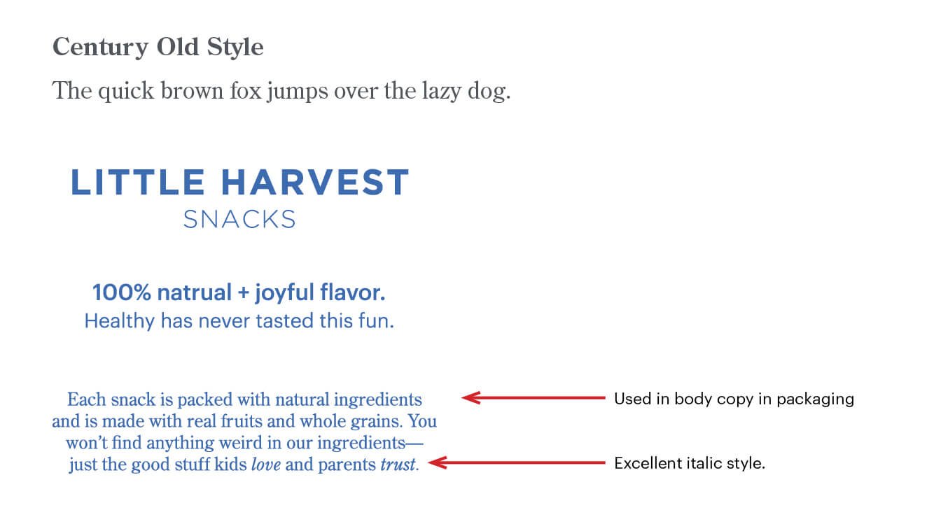
CENTURY OLD STYLE
If you’re looking for a traditional and timeless font, this font from Adobe is the one to go with. The name says it all and looks amazing in print. Another thing I like about this font is the italicized style of its letters. Believe it or not, I’ll sometimes discard a font solely because I don’t like the italicized style of it. It doesn’t have many variations, just your basic normal, italic and bold. But sometimes, especially in body copy, that’s really all you need.
KEPLER STANDARD
I consider Kepler to be a little more contemporary in its letterforms. Very clean with slightly rounded letters, Kepler is an Adobe font that works well in things such as brochures and flyers. If you like the look of a serif font but don’t want something that’s too strict or structured, Kepler is the way to go.

PP EDITORIAL NEW
Another amazing typewriter looking font is PP Editorial New. As the name suggests, this font look great for editorial type copy. With its long and narrow serifs, this font is elegant, to say the least. It’s also a font that looks great as pull quote text. With a variety of styles such as thin, regular, italic, bold italic, bold, and heavy, this sans serif font is very versatile and is one of my favorites to use.

So, there you have it, my ten top serif fonts that I use in design. As always, everything design-wise is subjective so perhaps my choices wouldn’t be your choices, but it’s great to share these with you in case you find yourself in a creative rut and want some help along the way. If you liked this blog post, stay tuned for my next blog post where I share my ten top sans serif fonts that I use in design.
Like the look of these fonts and want to have them as your go-to reference? Download my free “Ten Top Serif Fonts I Use For Design” chart for your reference library. Each of the fonts is an active link that will take you right to the site where you can download them if you’d like. Please be aware that you must be a Creative Cloud subscriber to be able to download the fonts from Adobe.