
Niebla—Mezcalería & Cocina Branding
Brooklyn, NY
PROJECT SCOPE
CLIENT TYPE: CONCEPT
INDUSTRY: BOUTIQUE HOSPITALITY | FOOD & BEVERAGE
DELIVERABLES: BRAND IDENTITY, MENU DESIGN, COLLATERAL
YEAR: 2026
Niebla is Spanish for fog — the kind that settles low in the Valles Centrales before the sun burns it off. It is a serious name in a serious language, chosen by a chef who knew exactly what she was building.
Elena Mendoza-Ruiz was born in Queens to parents from Tlacolula de Matamoros. She trained in New York kitchens before spending three years cooking in Oaxaca — first in a tasting-menu restaurant in the Centro, later in family-run fondas in the villages. Niebla is her first solo project. She is not importing Oaxaca to Brooklyn. She is not Americanizing Oaxaca for Brooklyn. She is cooking from a bicultural vantage point that is itself the concept, and the brand's only job is to not get in the way of that.
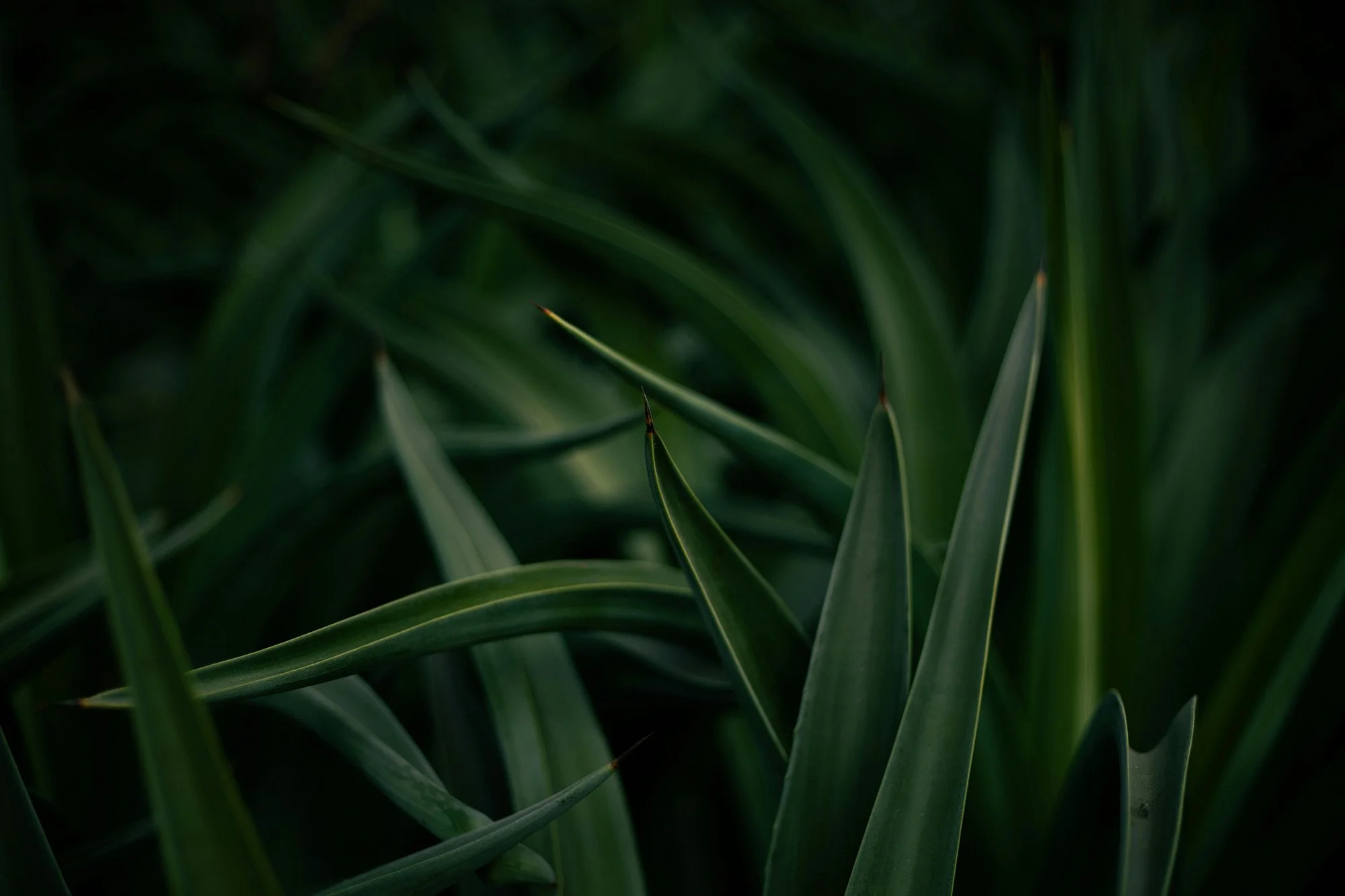
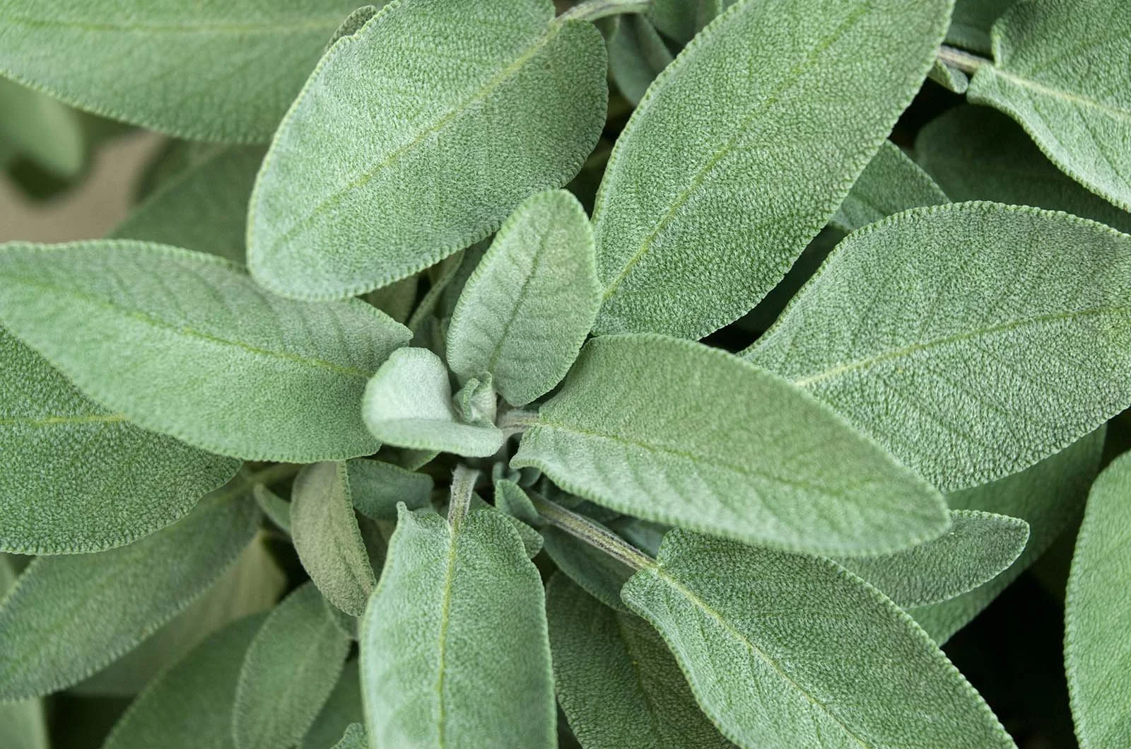
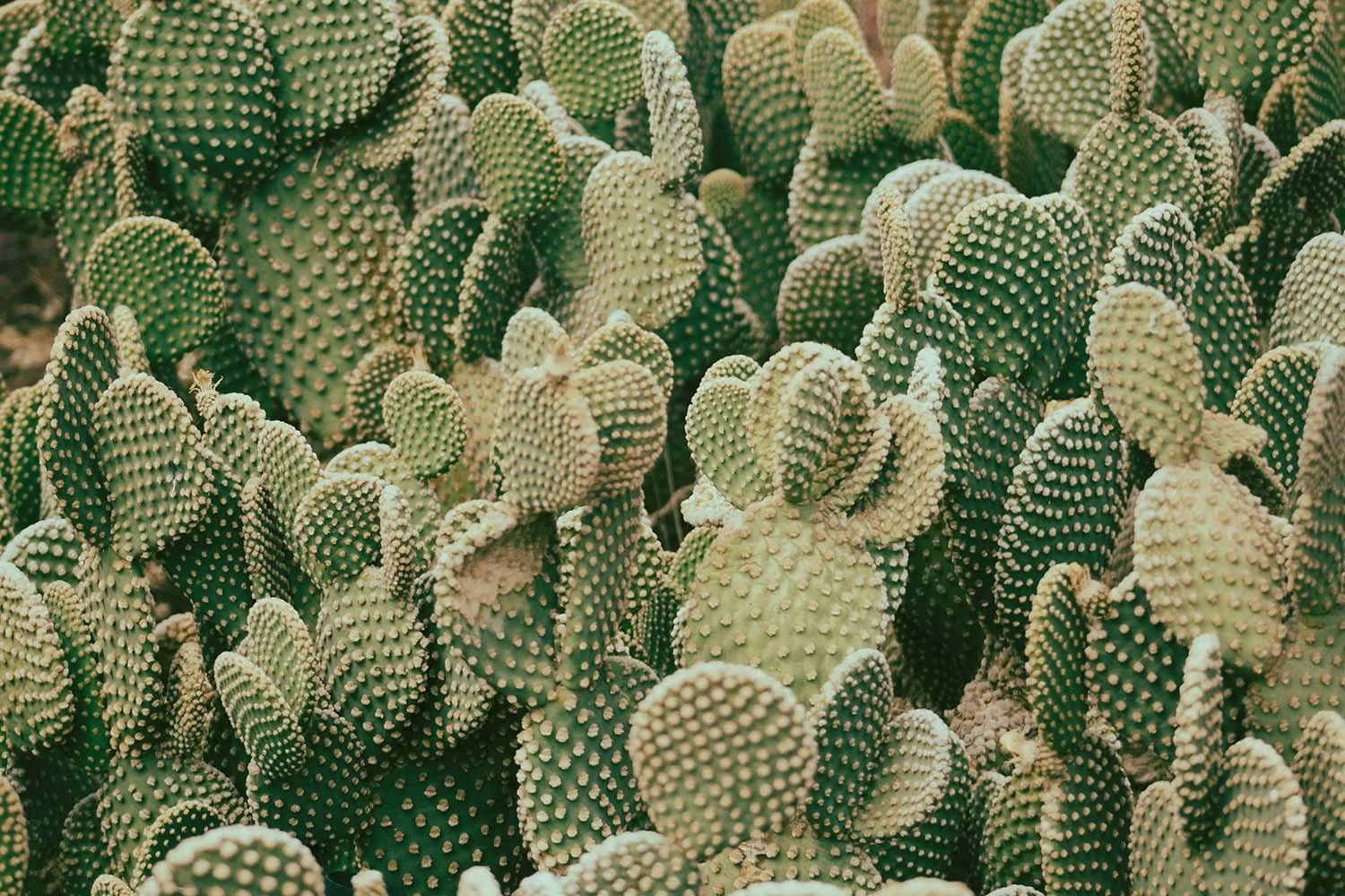
INSPIRATION COLOR PALETTE








THE IDENTITY
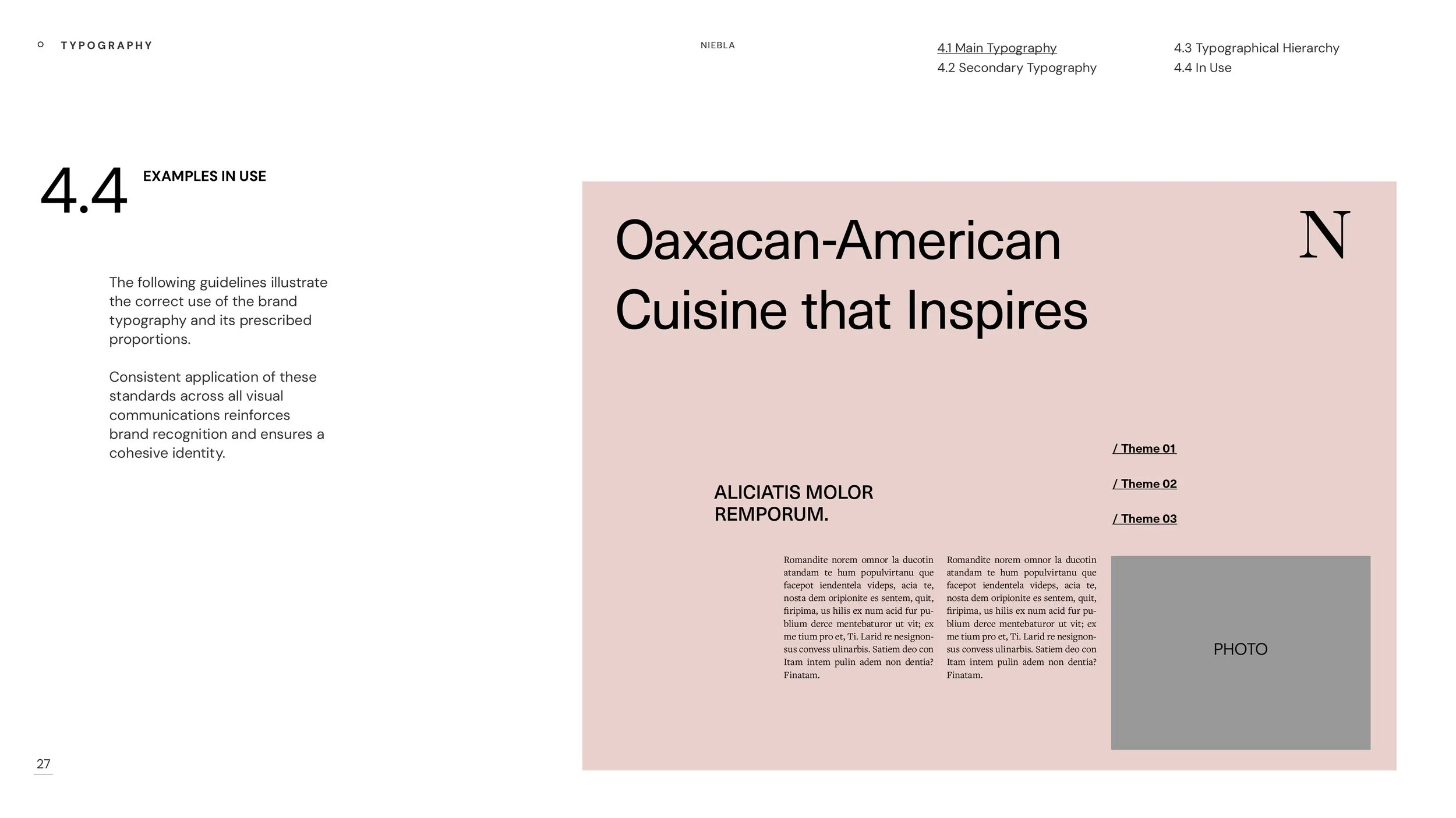
Niebla is Elena's first solo project. The wordmark for “Niebla” is set in Baskerville — a typeface with enough typographic weight to hold a serious restaurant concept, and enough restraint to let the name speak for itself. This is not a brand built around a gimmick or a trend. It is built around a point of view that took years to earn.
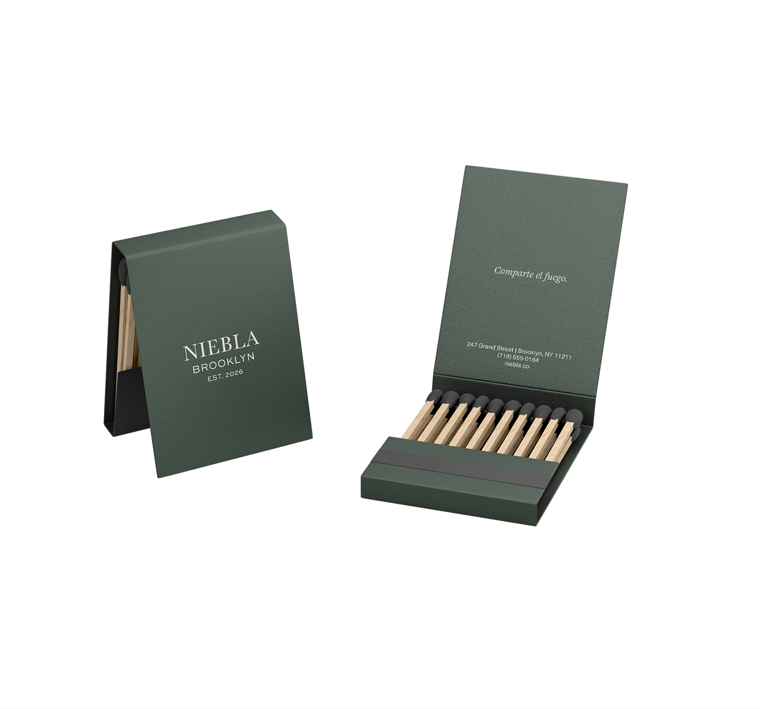
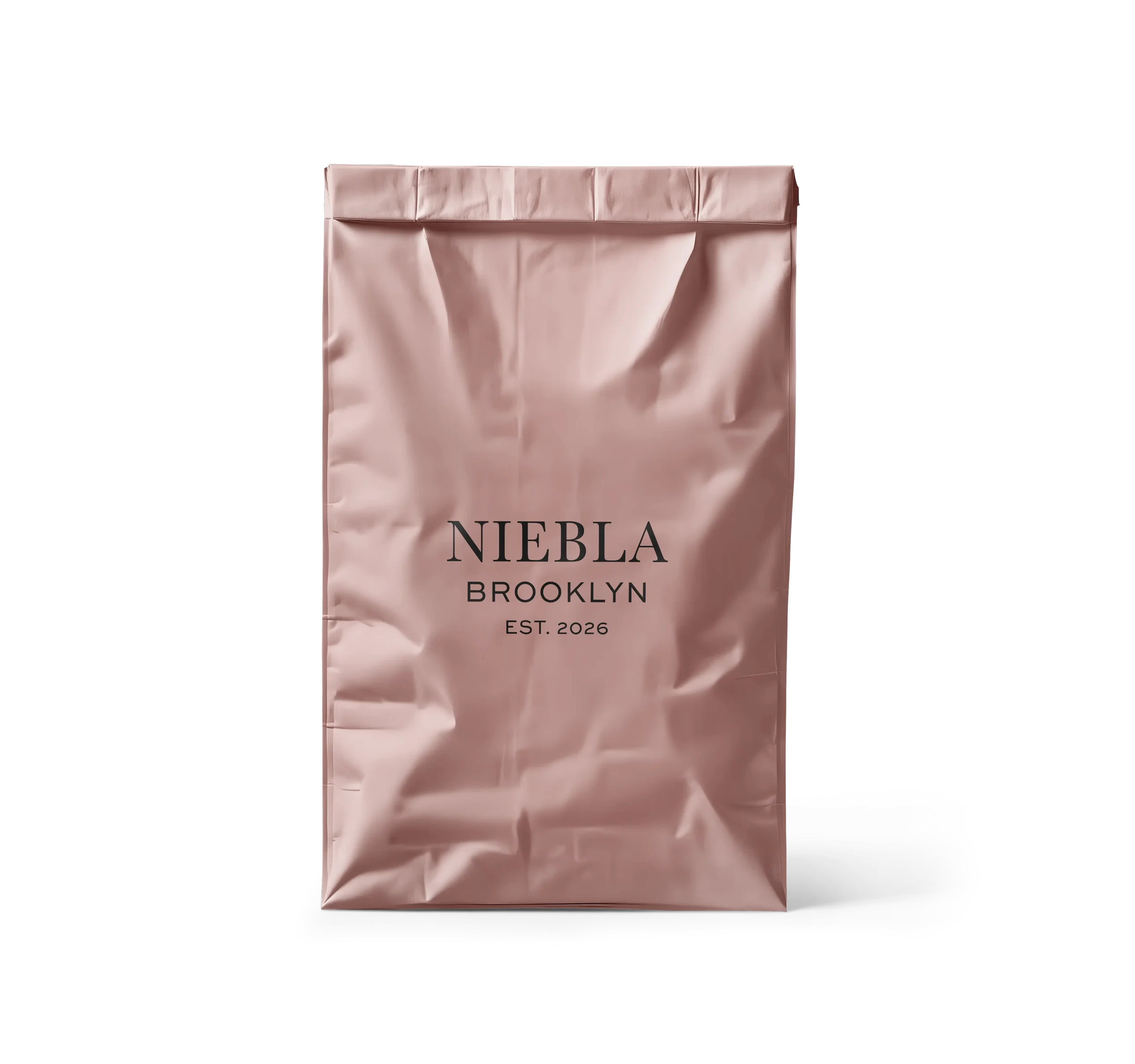
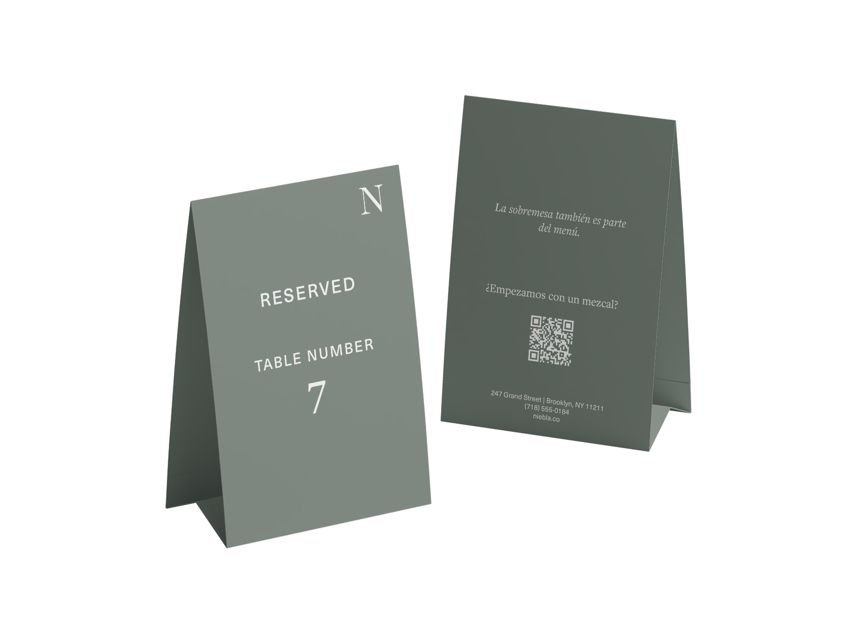
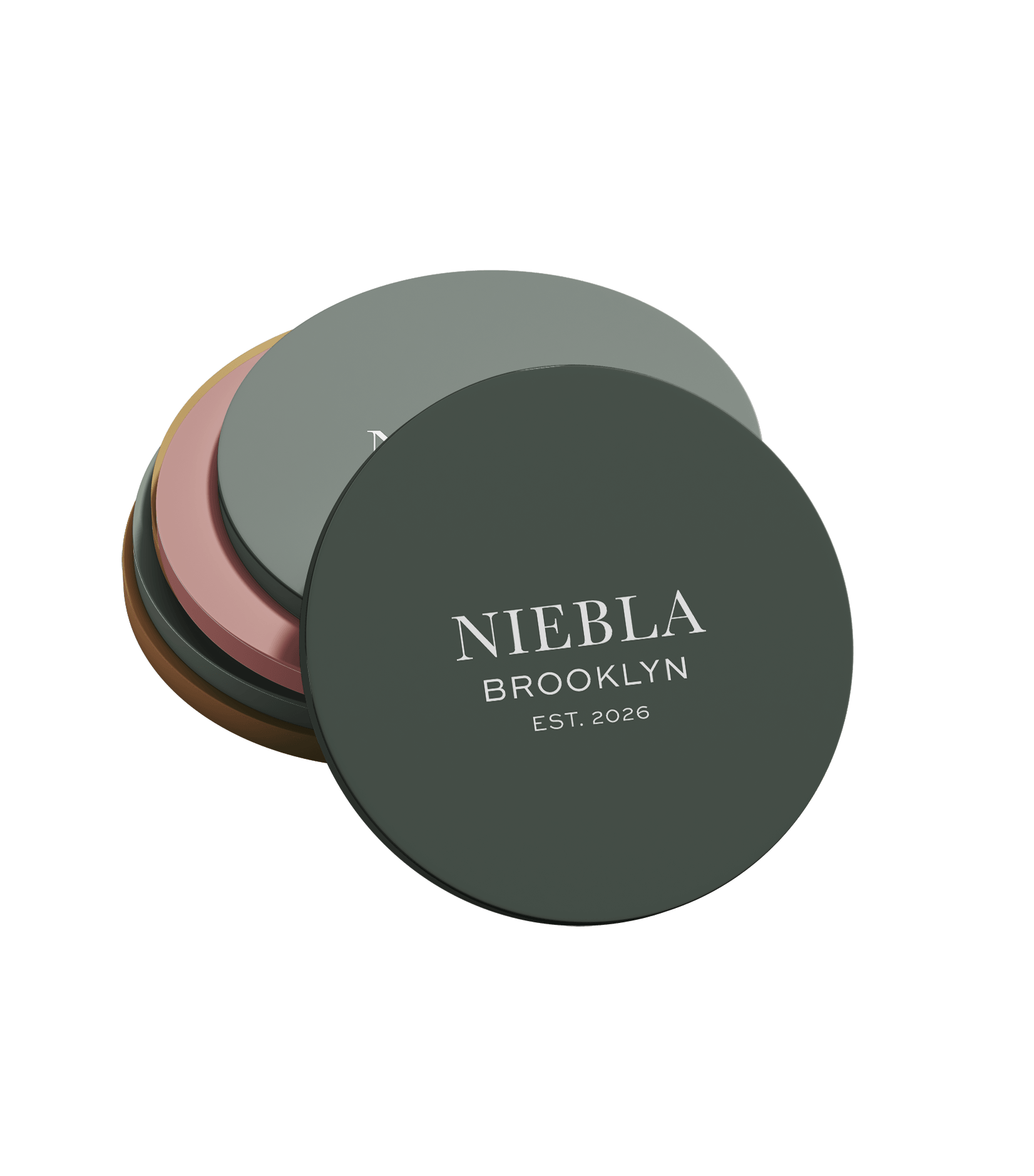
The word "Brooklyn" sits below “Niebla” in Sweet Sans Pro, tracked wide — less a secondary logo element, more a caption. The secondary mark is a single Baskerville N: the word mark compressed to its essential character, used where the full mark would be too much. The relationship between Baskerville and Sweet Sans reads as a quiet argument — one old, one contemporary — with no interest in resolving the tension.


THE SYSTEM
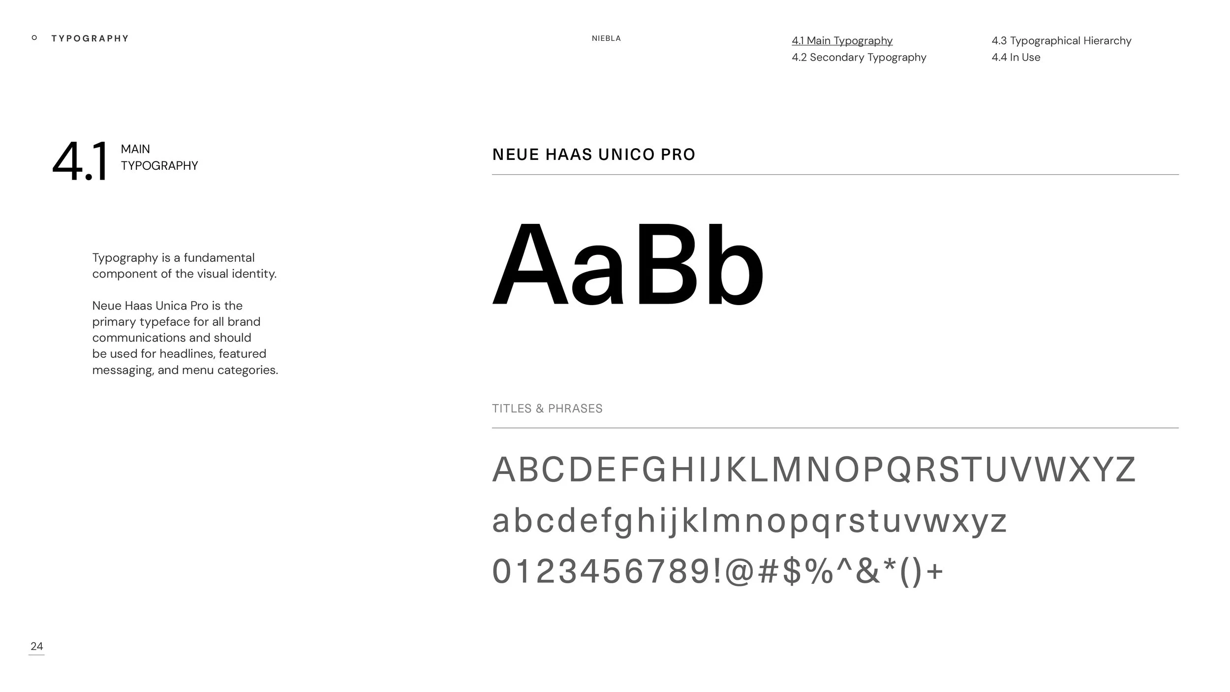
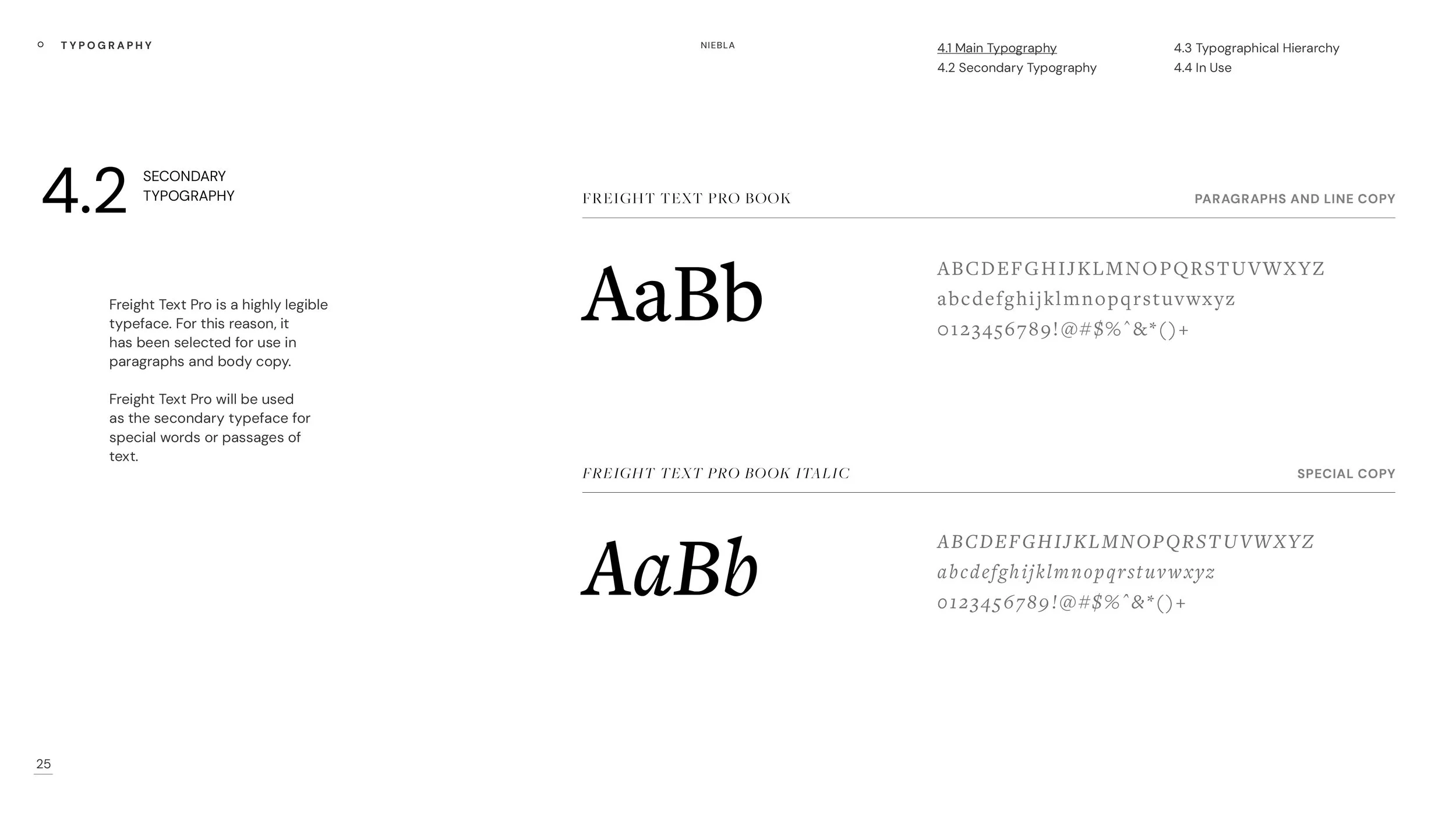
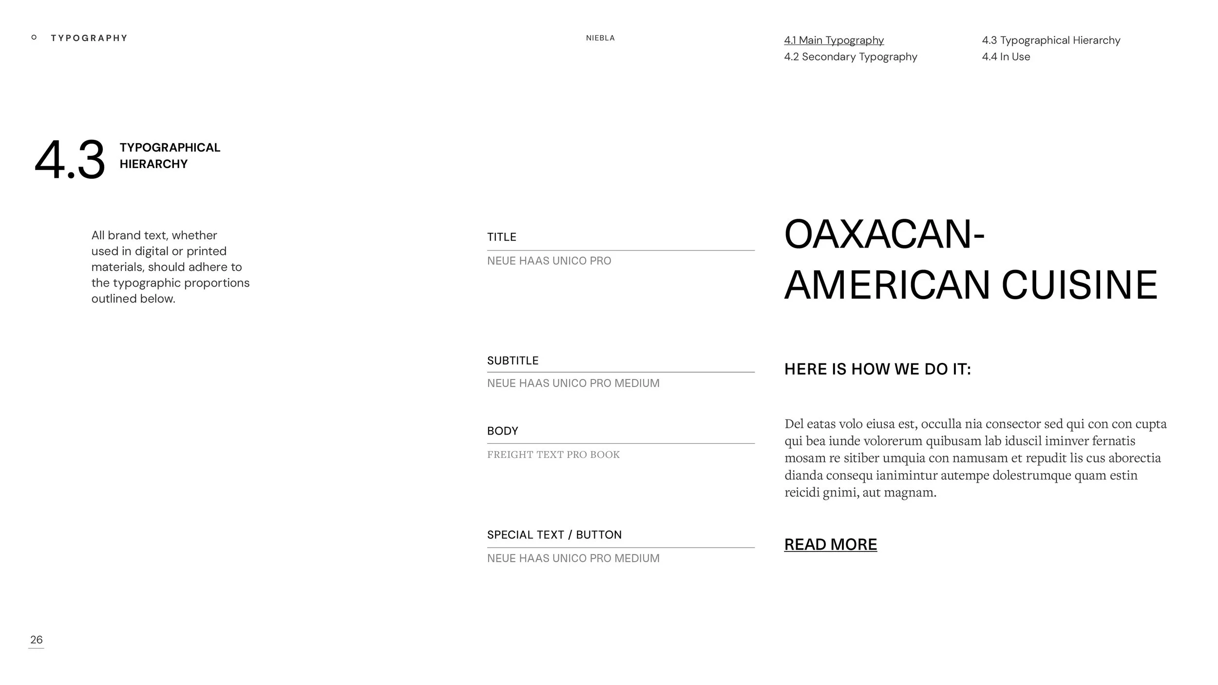
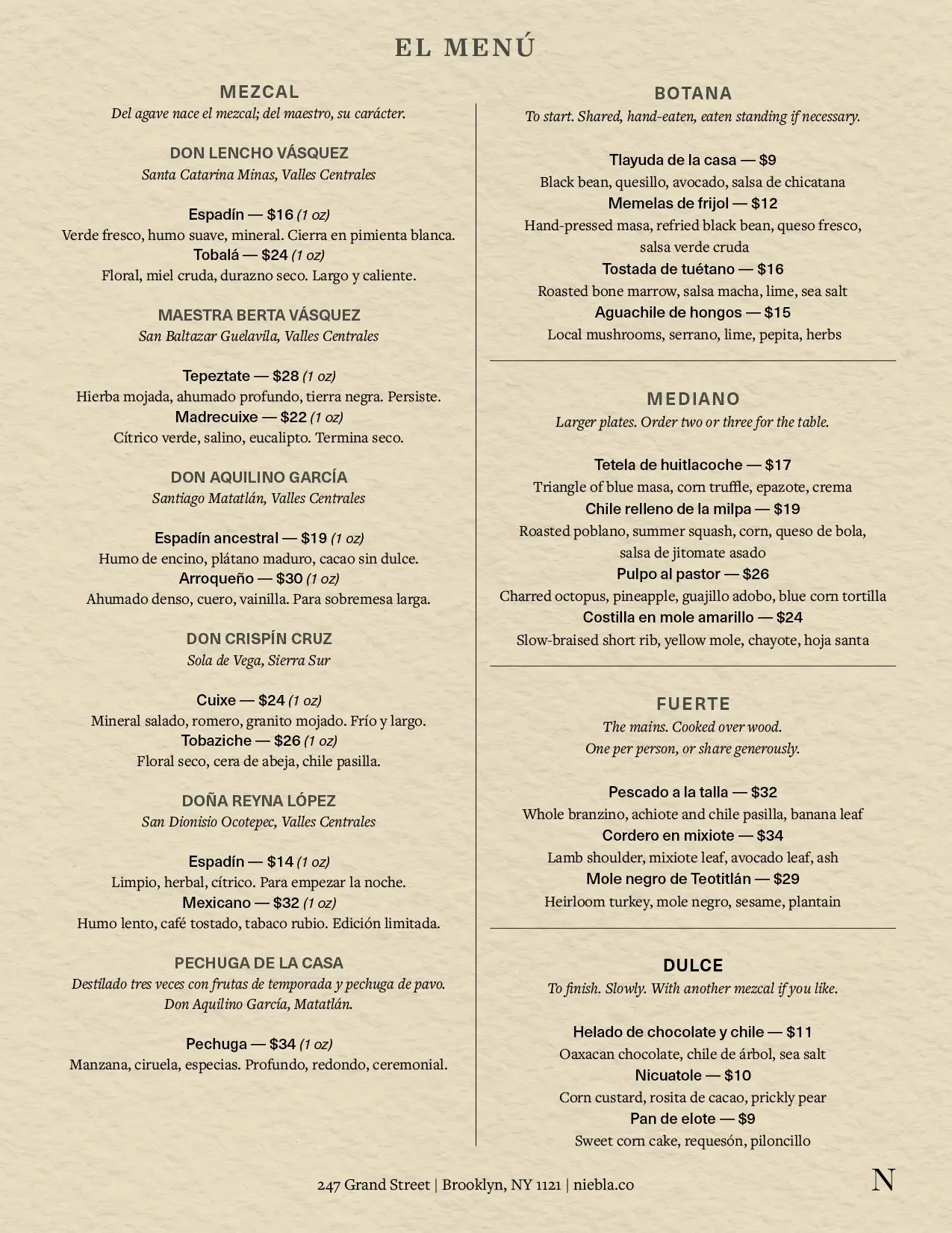
Neue Haas Unica Pro handles all working type: menus, web, address blocks. It is Swiss grotesque in its bones but warmer than Helvetica and less self-conscious than Akzidenz. It disappears into the page, which is exactly what menu typography should do. Freight Text Pro handles the occasions where something needs to be read at length — printed materials, the website's editorial sections.
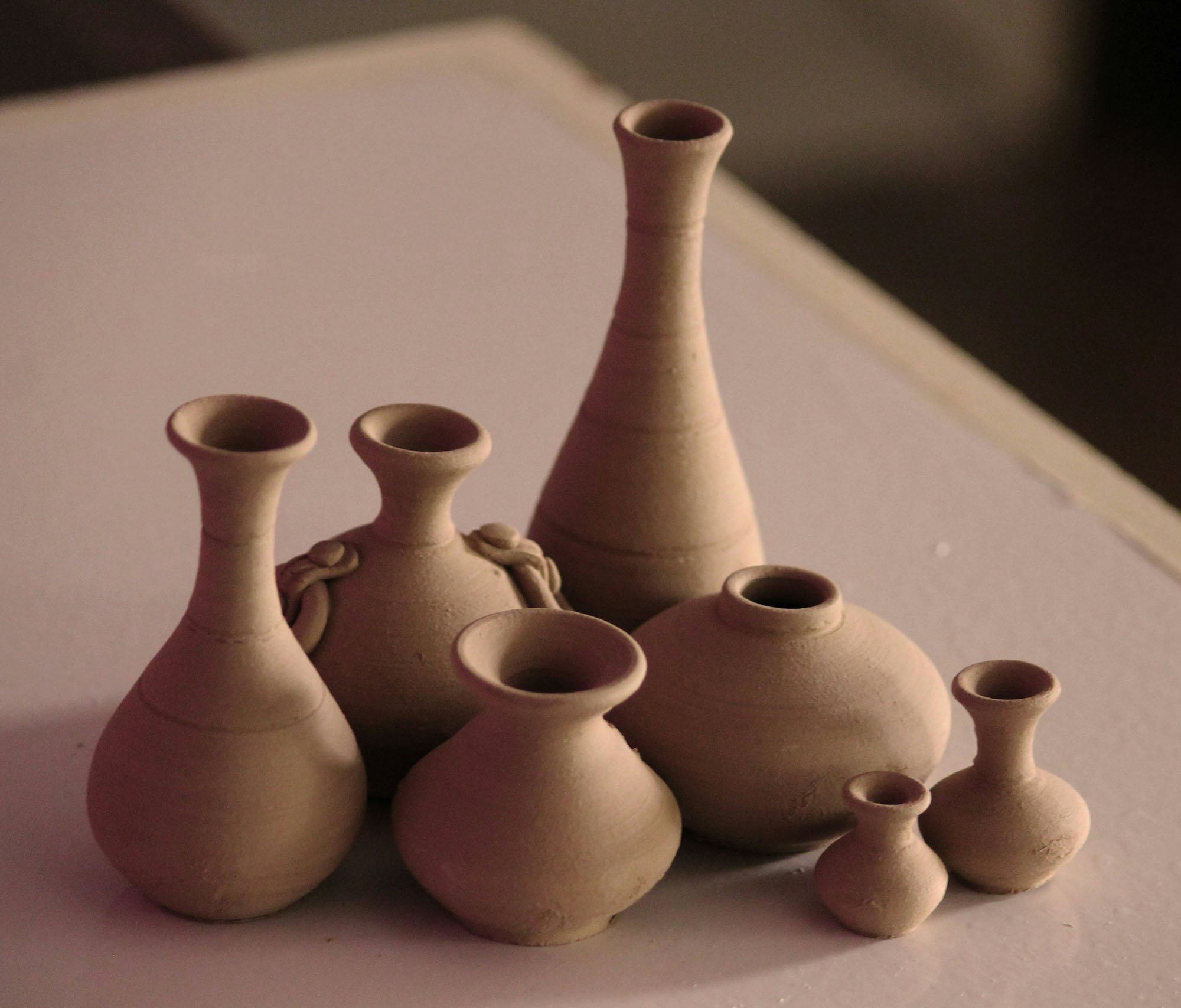
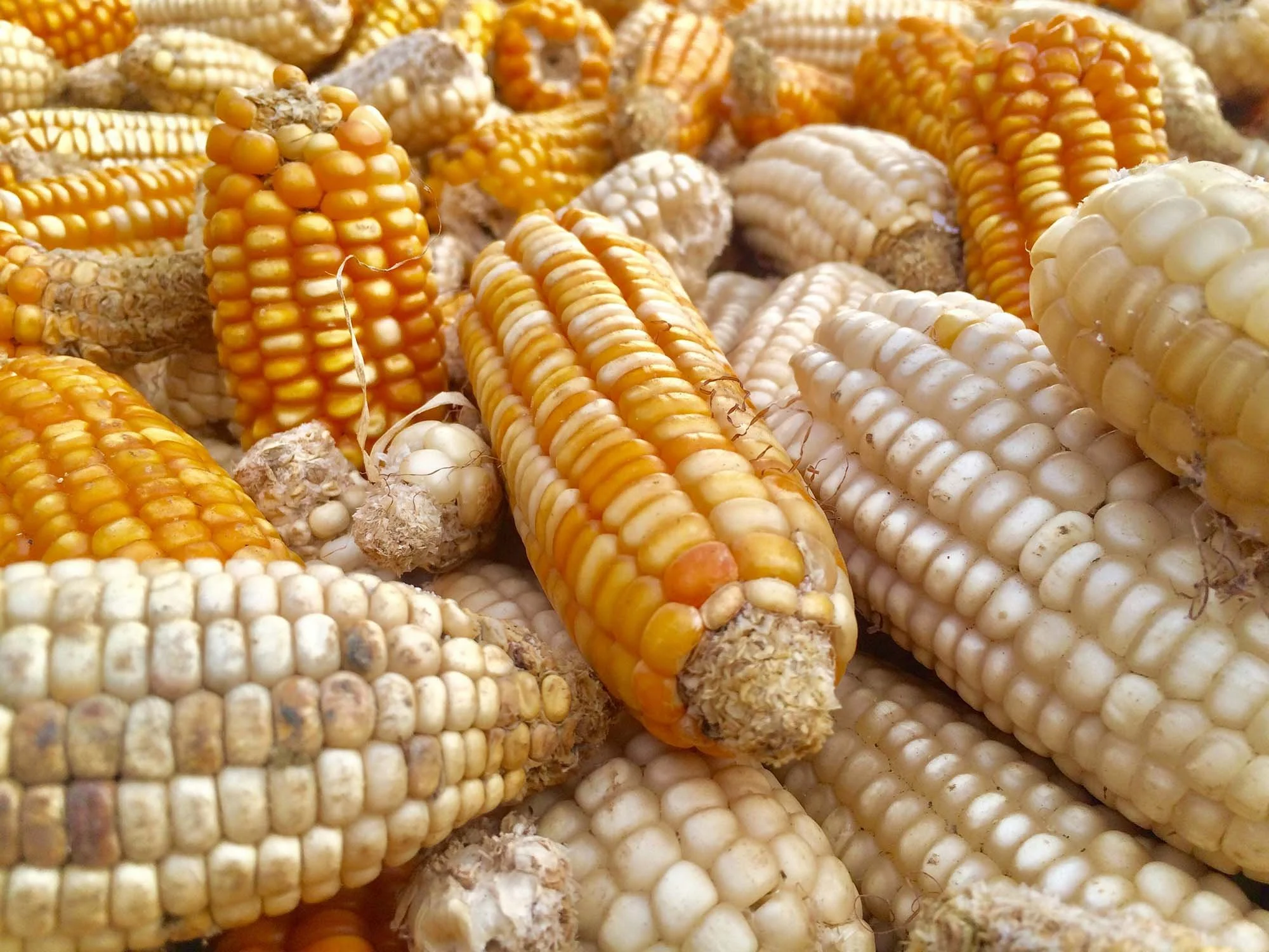
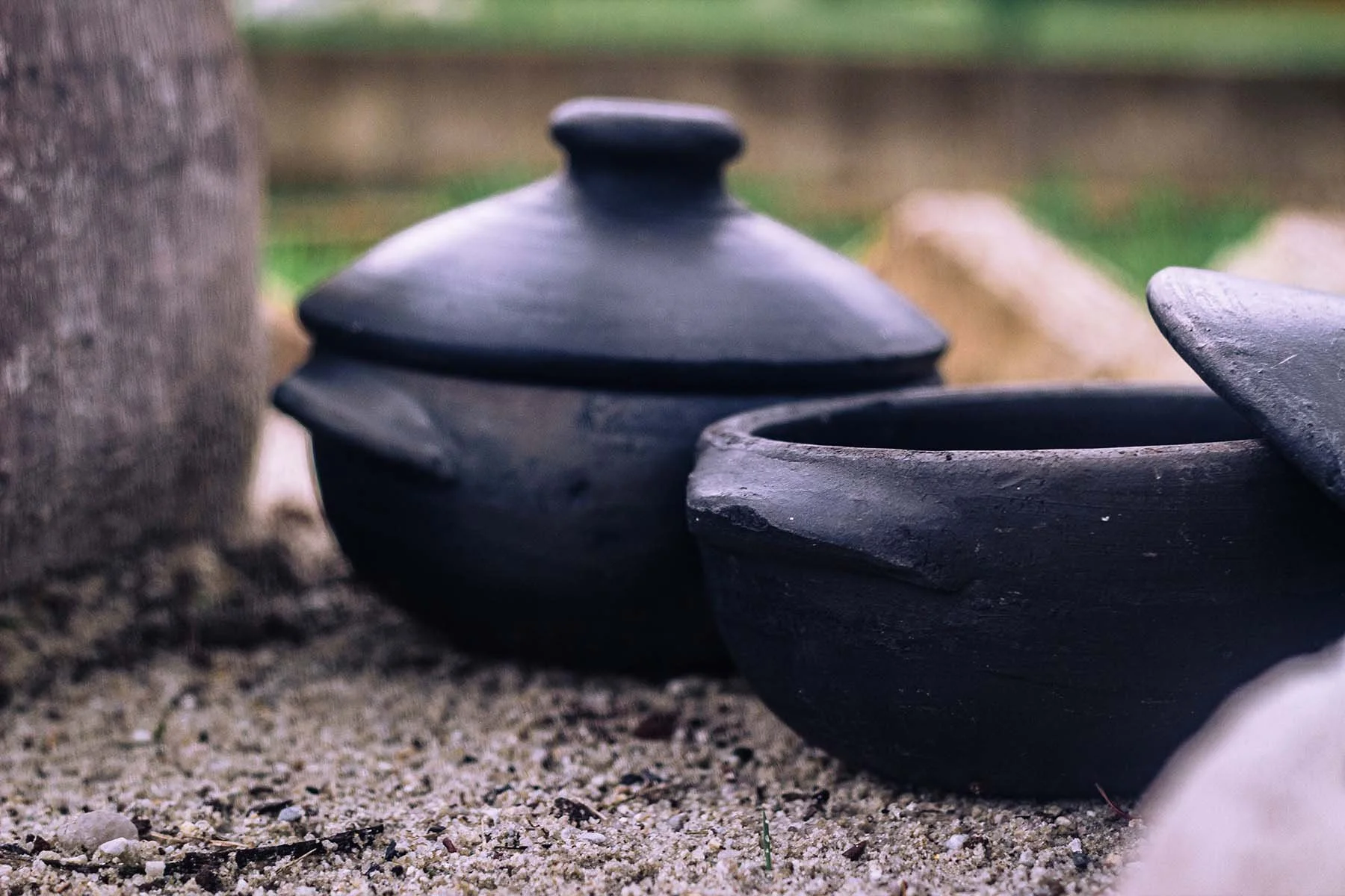
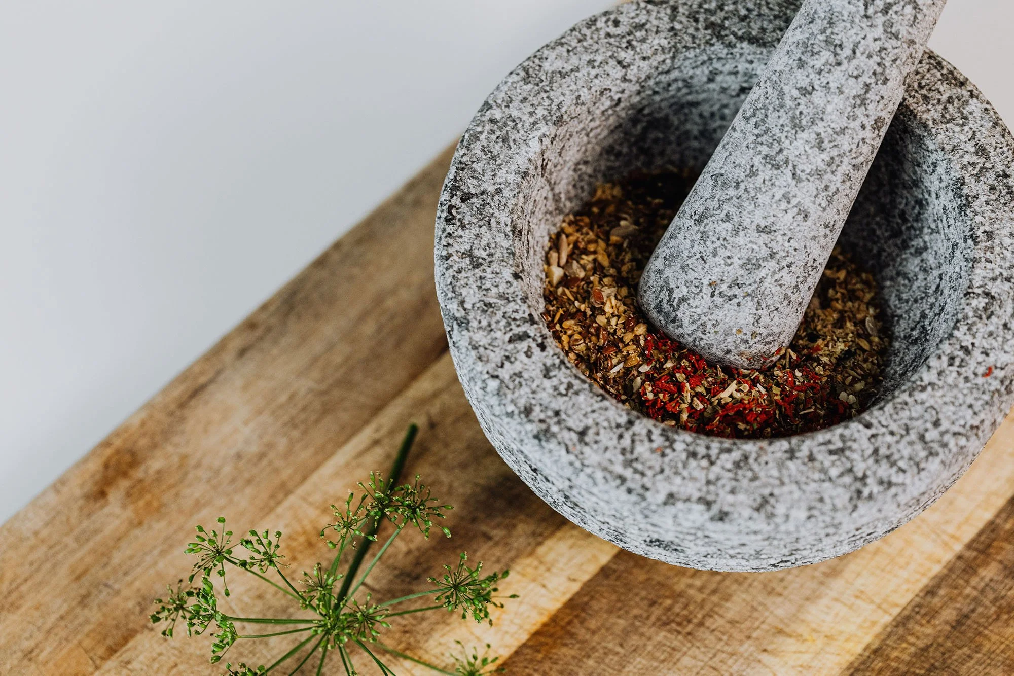
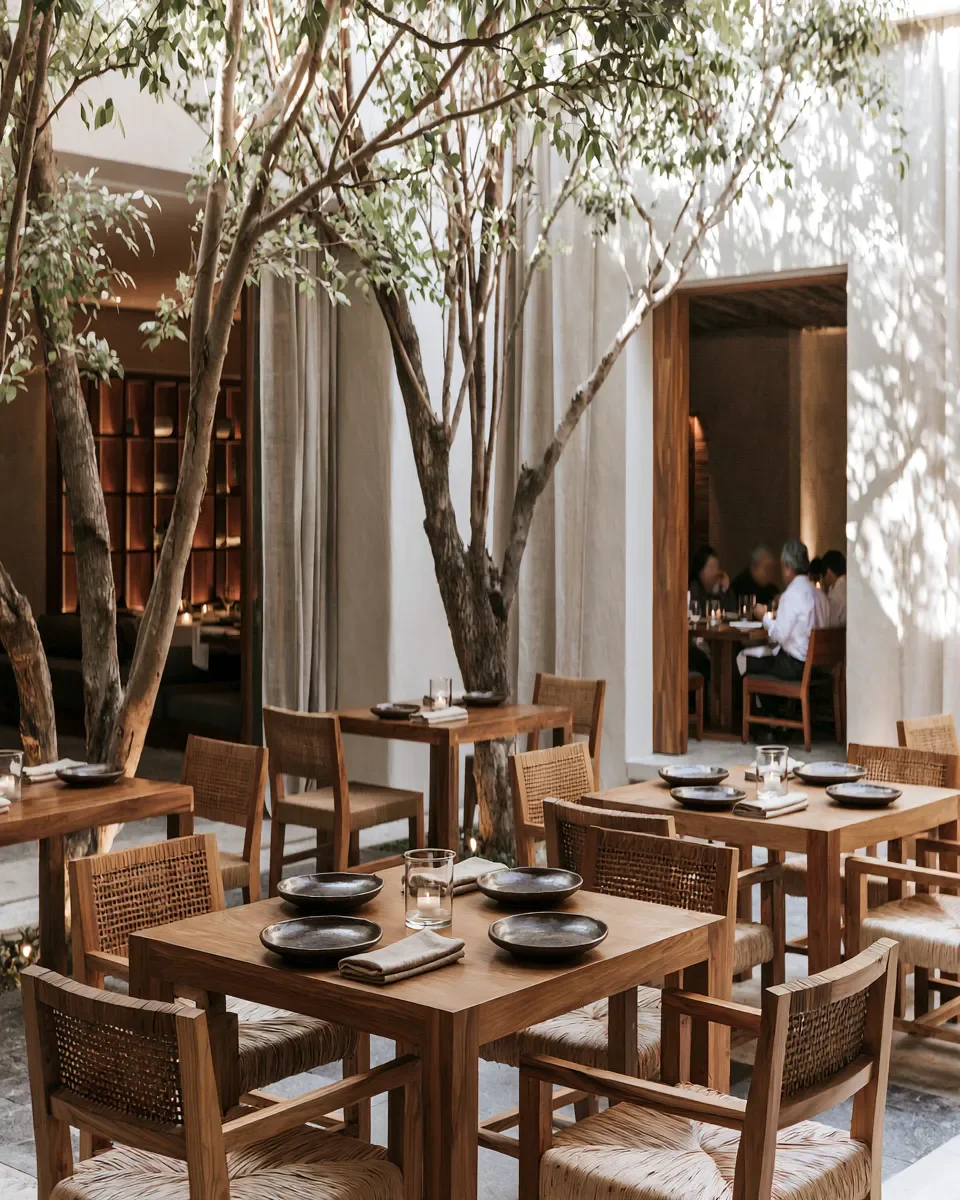
The color palette was pulled from the conditions of the place: the deep green of barro negro clay, raw masa cream, volcanic stone, dusty rose, dull gold at late afternoon. Nothing that couldn't be found inside the building on a given Tuesday. The stationery suite — menu covers, coasters, matches, table cards — is held together by restraint. One color field at a time. The mark alone when that's enough.
Collateral Design
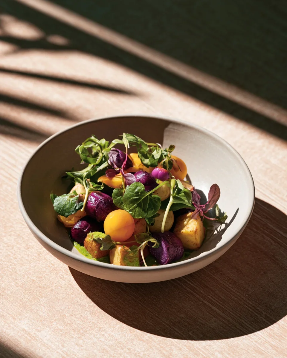
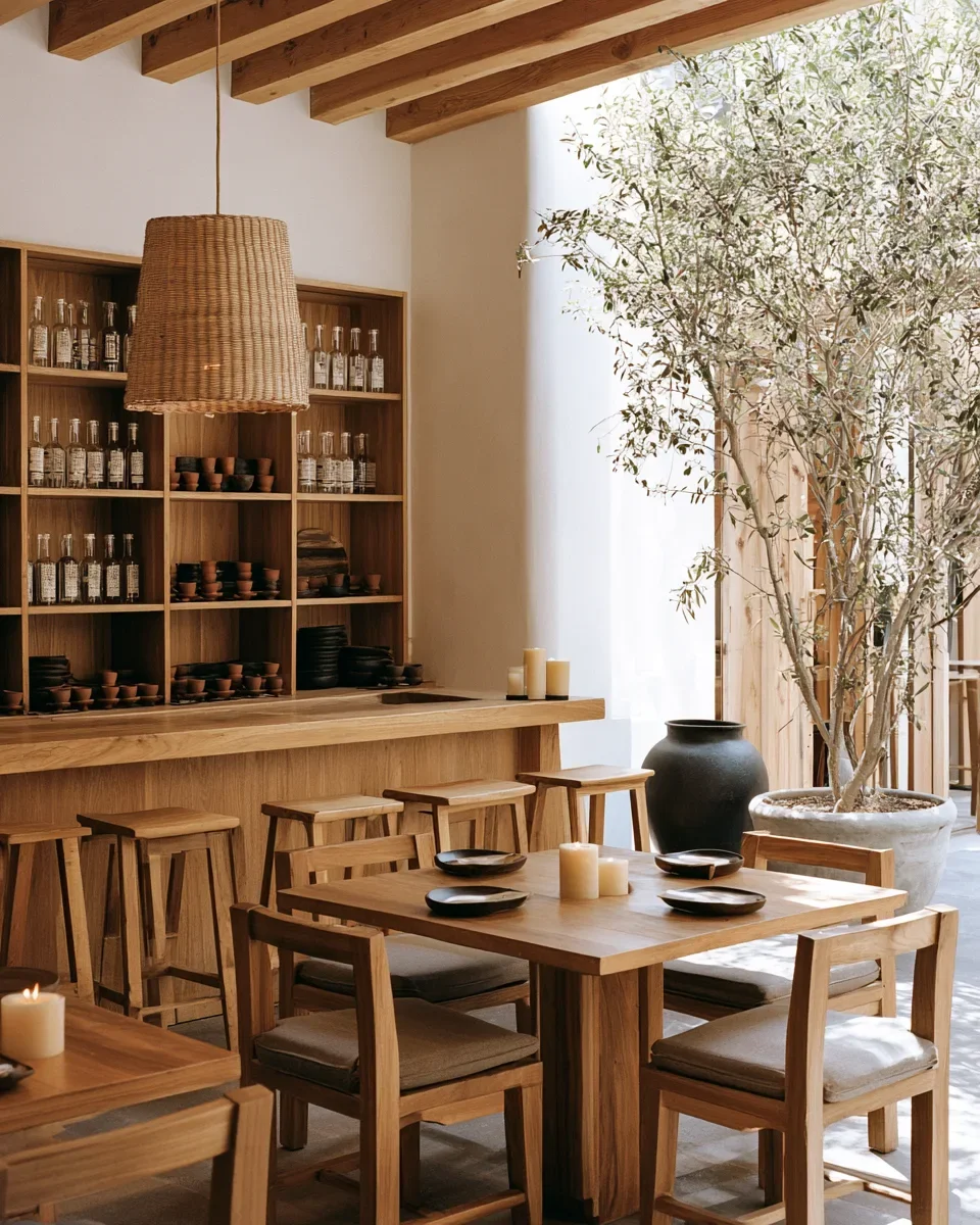
Smoke and citrus. Bitter and floral. Earth and salt. You either know what you're tasting or you're about to find out.
A brand like this carries through to the menu, the signage, and the website. See my restaurant menu design services, or tell me about your project.
Working on something similar?