
Cantera—Boutique Hotel Branding
Charleston, SC
CLIENT TYPE: CONCEPT
INDUSTRY: BOUTIQUE HOSPITALITY
DELIVERABLES: BRAND IDENTITY, STATIONERY
SUITE, GUEST COLLATERAL
YEAR: 2026
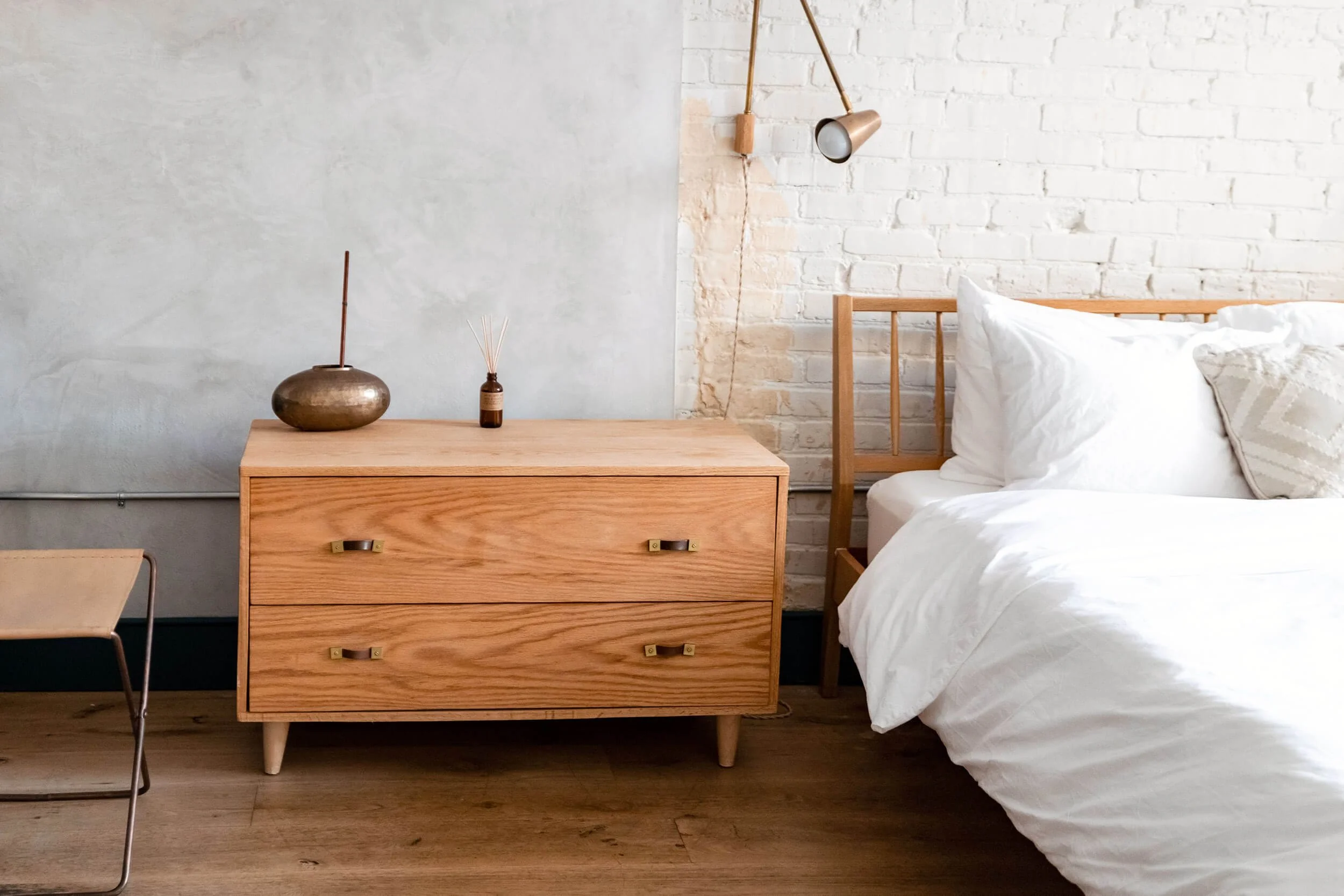
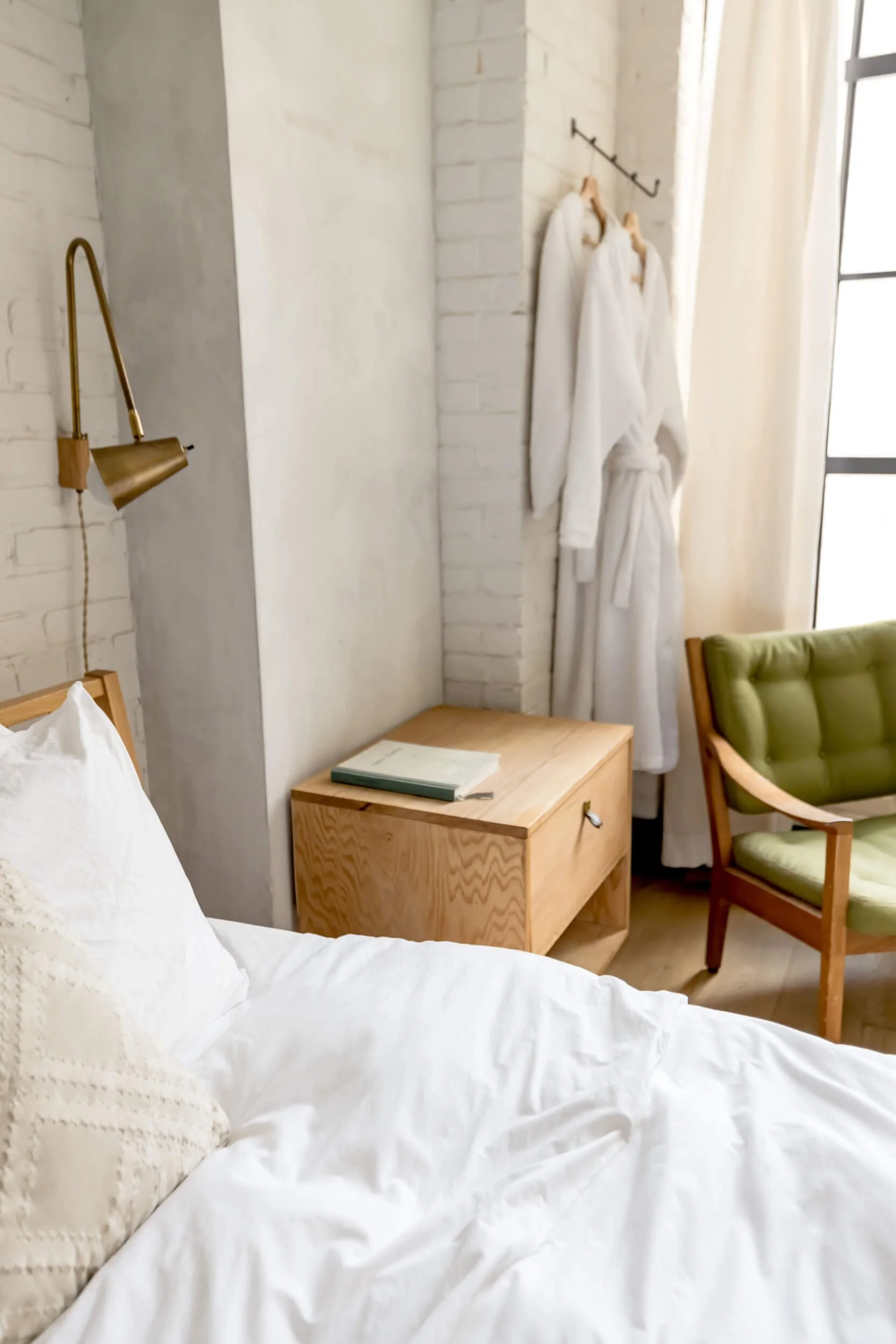
Cantera is a pre-Civil War single house in Charleston's Harleston Village. It has eight rooms with a corridor down the center and a large parlor that was used for entertaining during that era. Its charm caught the eye of the current owner who walked past it on a Thursday in October and called a real estate attorney the same afternoon to make an offer to purchase. Cantera is not a hotel concept. It is one architect's response to a building that asked to be restored, with rooms that are minimal in style to honor the materials that surround it.
The client, Marguerite Allard, spent three years on the structure before she thought about the rooms. The design problem wasn't how to make a historic property feel contemporary — it was how to build a brand as materially honest as the renovation itself. Nothing is applied and nothing is performed. Every decision legible as a response to this specific building, in this specific neighborhood, by this specific person.
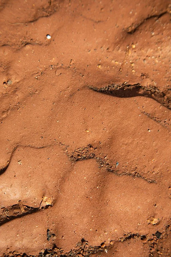
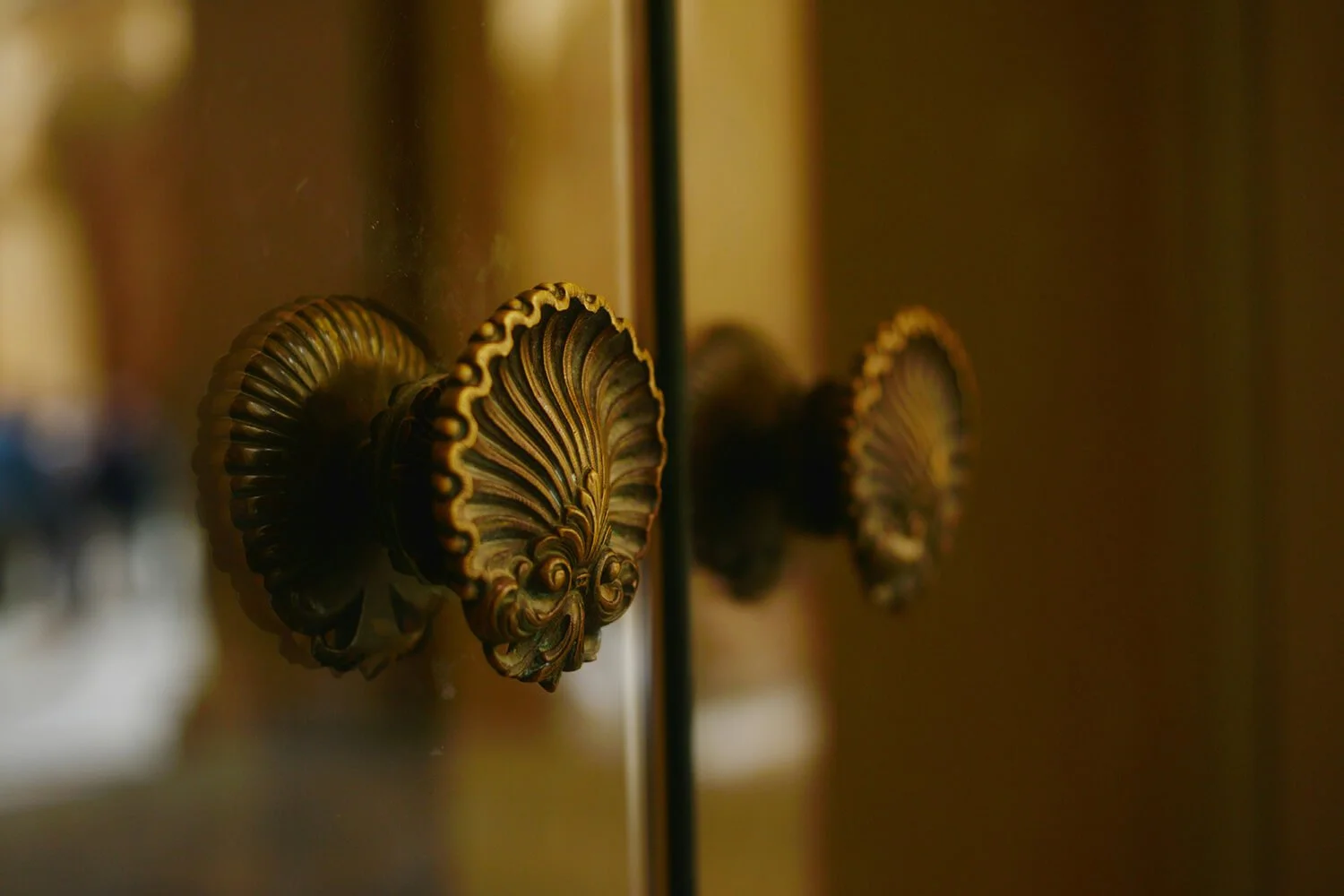
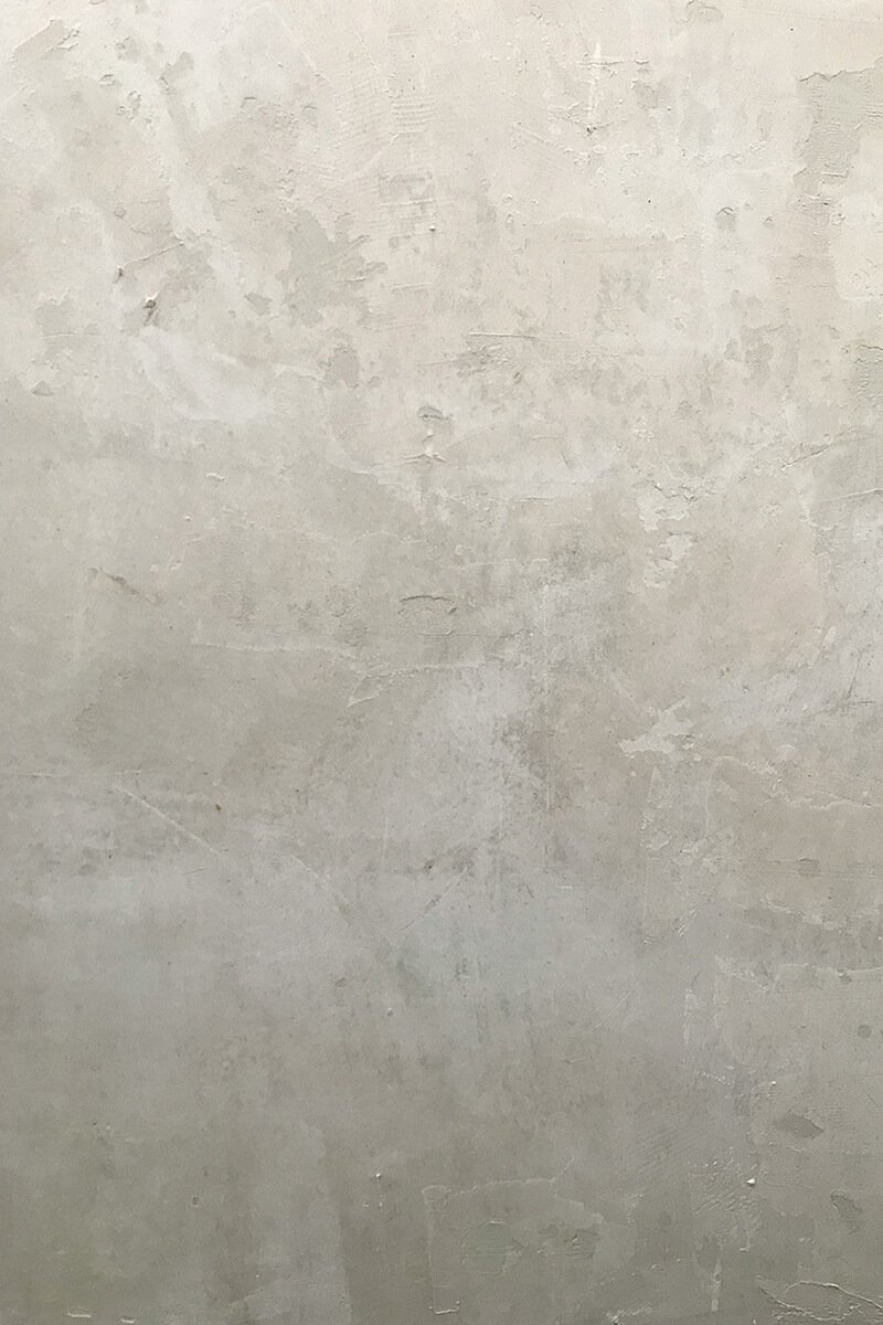
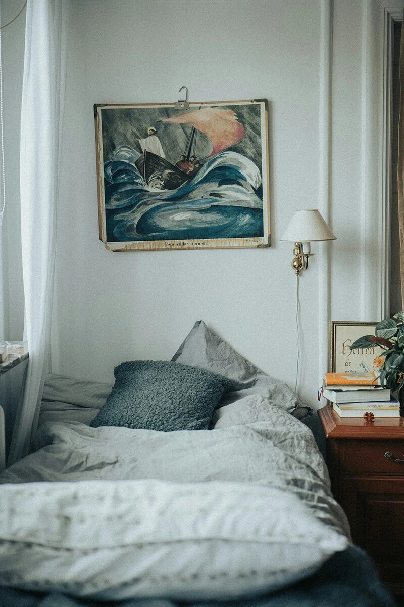
INSPIRATION COLOR PALETTE






THE IDENTITY
The word cantera is Spanish for quarry — the same cut stone in which the building is made of. It is also a posture: something excavated, revealed. The palette was pulled directly from the building's own material inventory: lime-wash white, heart pine amber, iron-oxide brick, blackened steel, and the gray-green of old Charleston ironwork. No Lowcountry pastels. No period signifiers. The colors of the actual materials, nothing more.
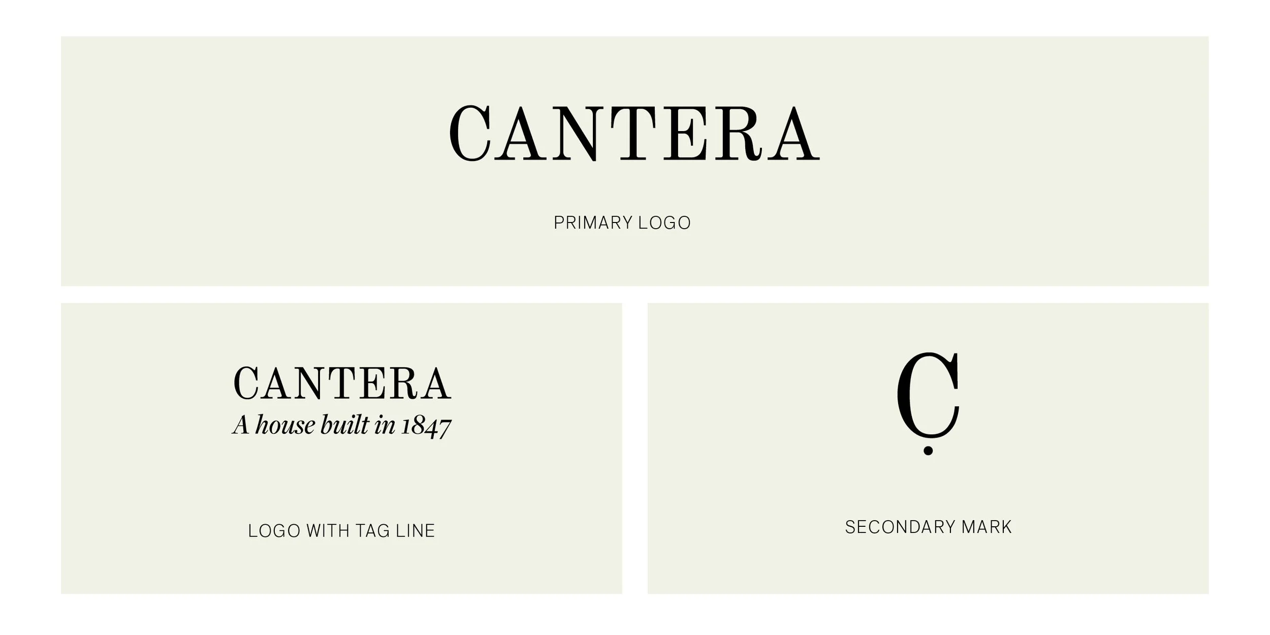
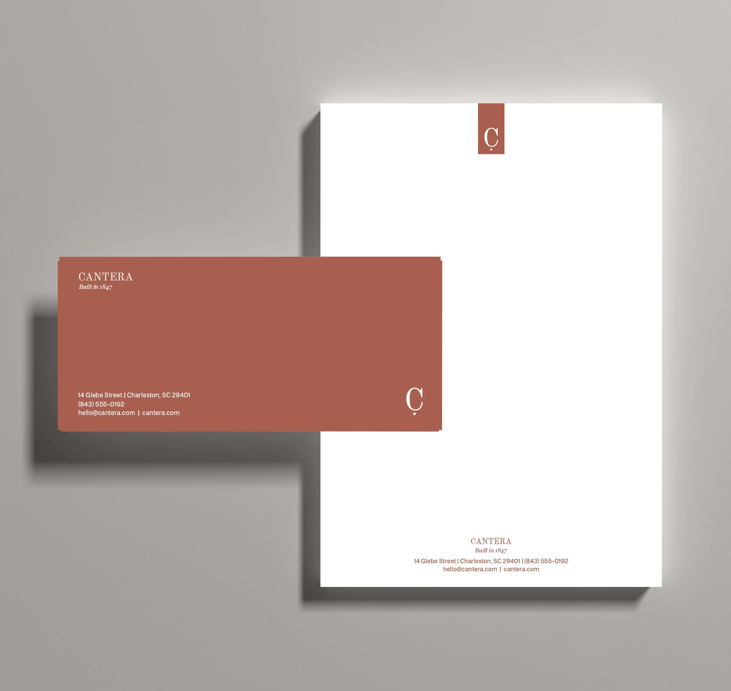
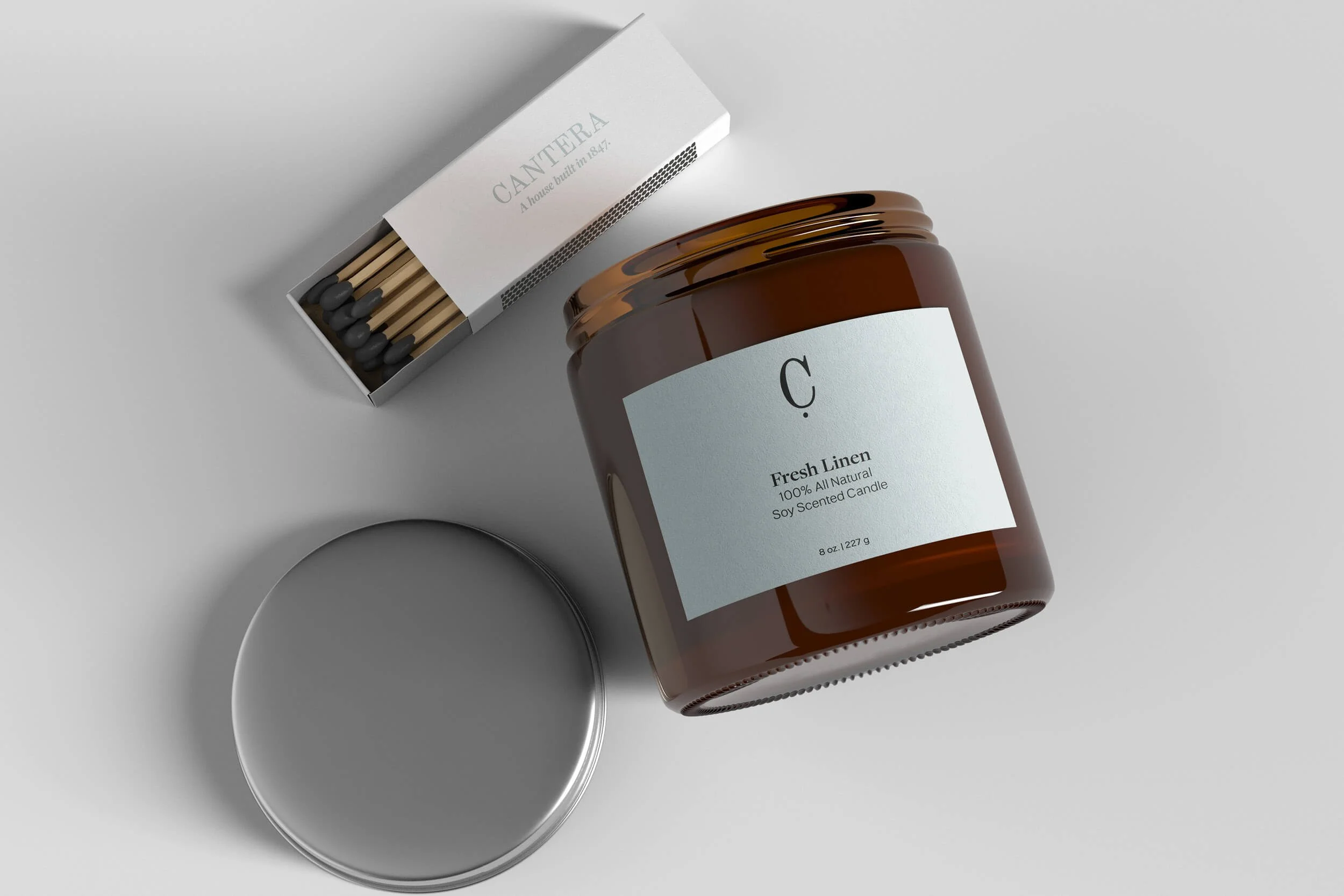
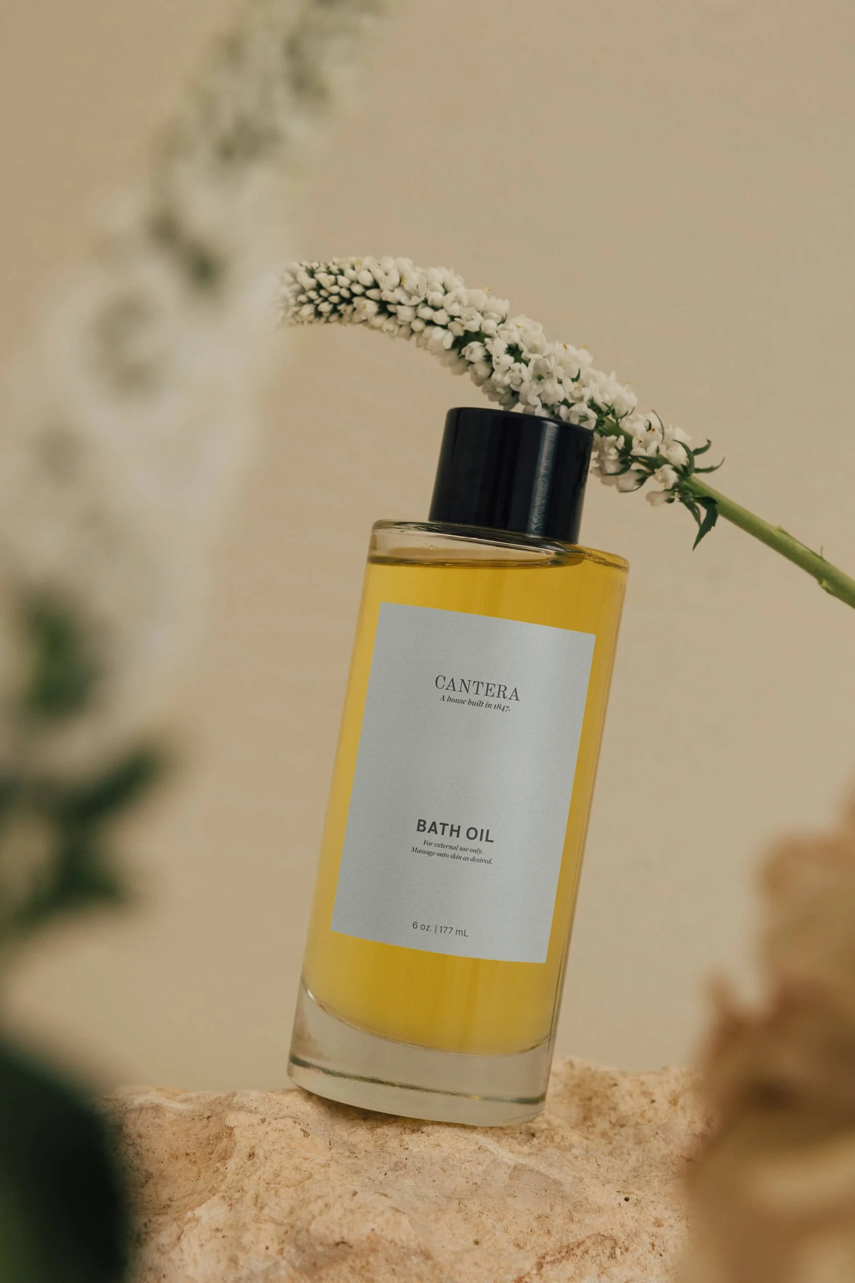
The word mark is set in Old Standard TT, tracked wide in all caps — architectural rather than decorative, legible as something carved rather than printed. It’s tag line speaks of the year the house was built. The secondary mark is the letter “C” with a period anchored below it. The period is not decorative. It is the same punctuation that ends every line of copy in this system. Decisive and final.
THE SYSTEM
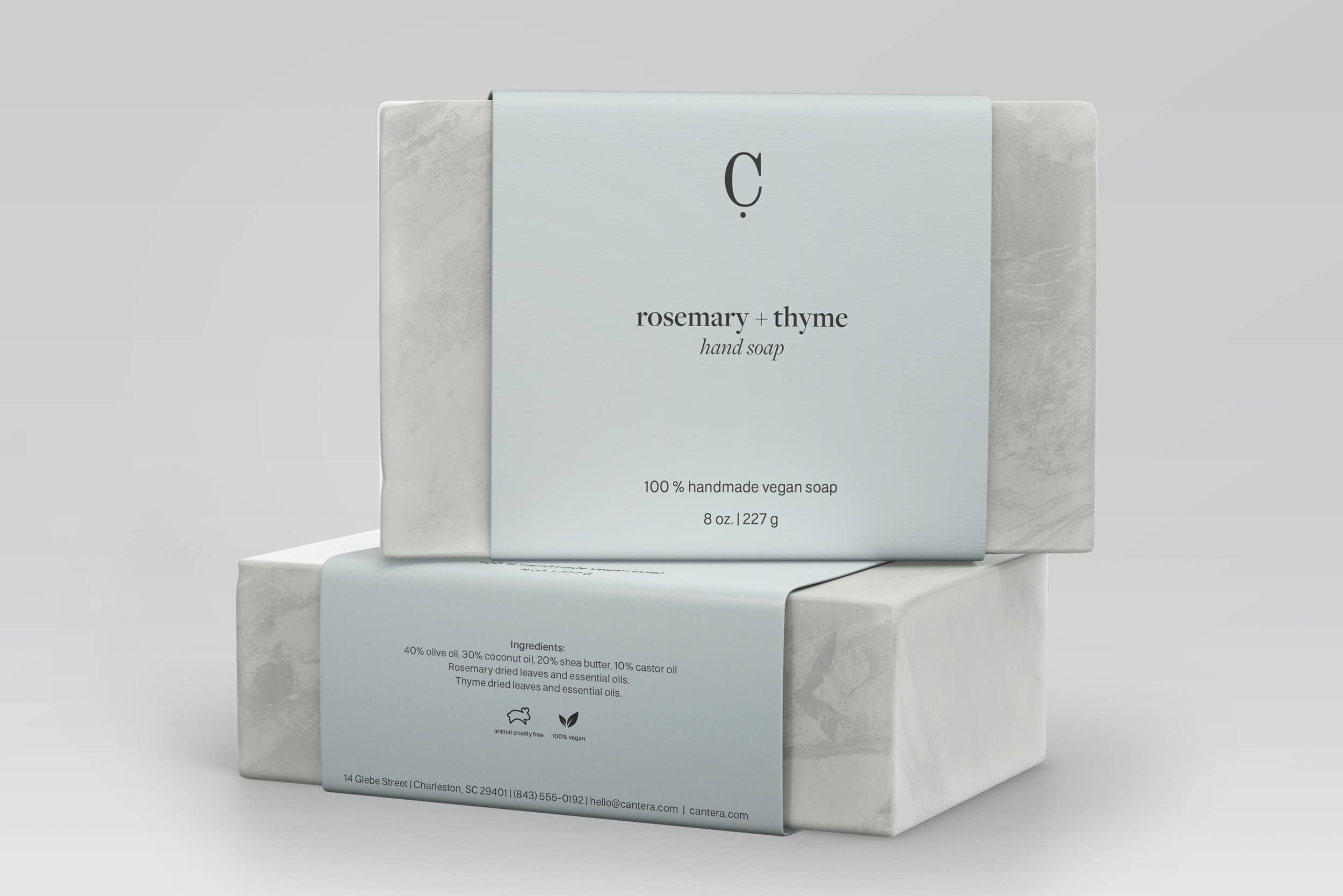
Freight Display Pro is a beautiful serif font that carries the expressive weight. Italic is used for subheads and it has enough historical authority to sit inside a 177-year-old building without reading as costume. Neue Swiss handles the working type as a strong sans serif can: neutral, precise, and invisible in the way good body type should be. Only two typefaces are used to keep with the integrity of the architectural design elements. No exceptions.
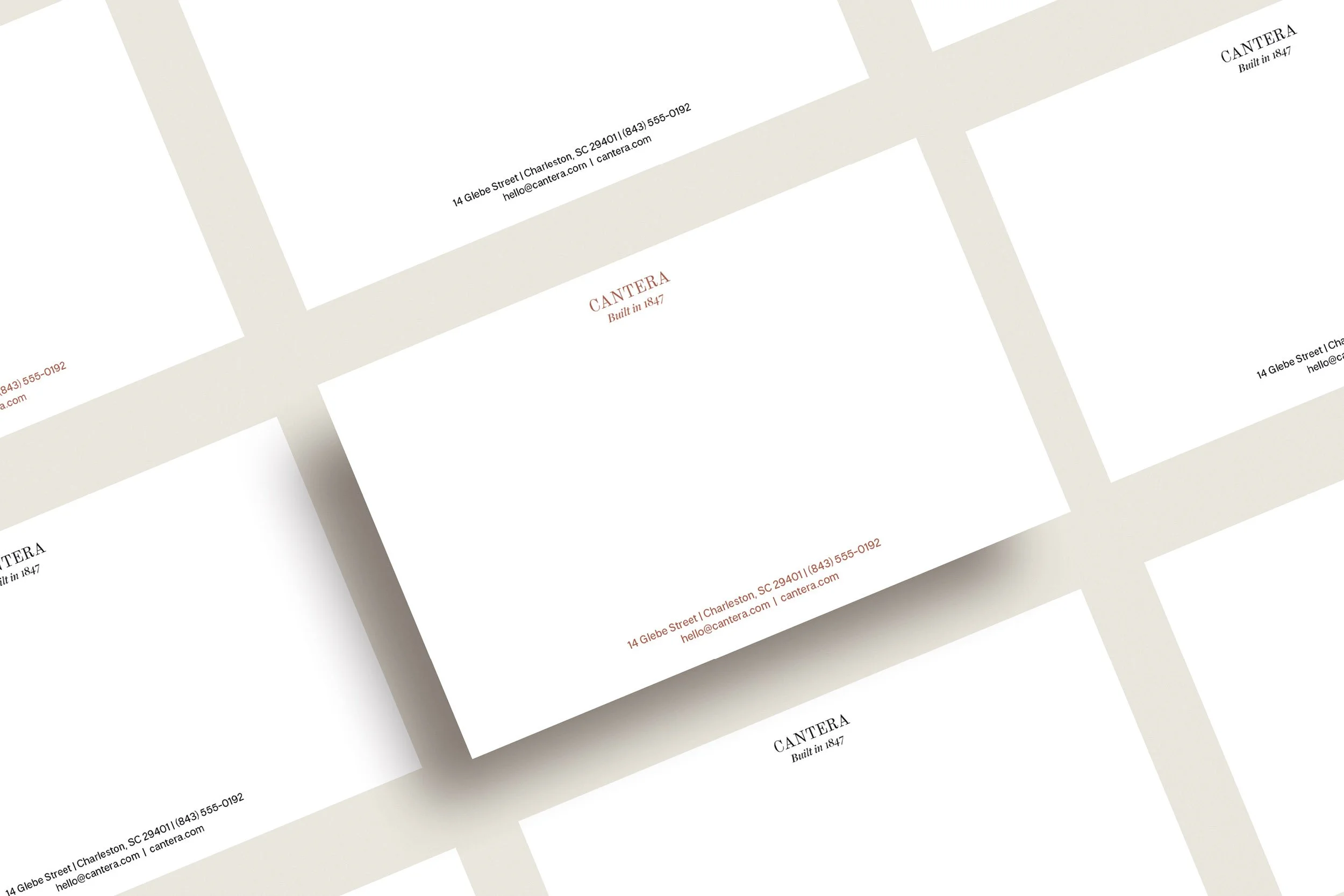
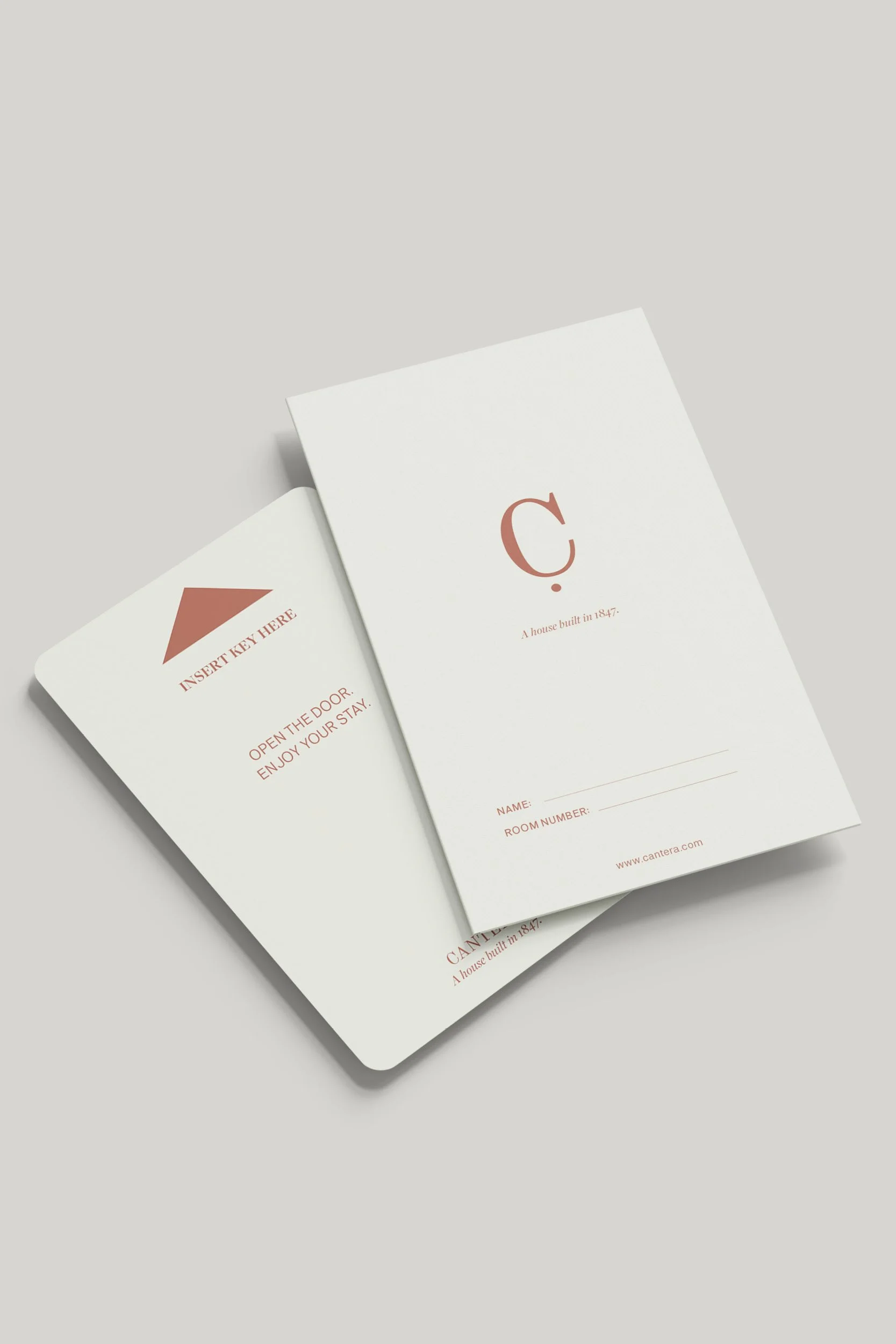
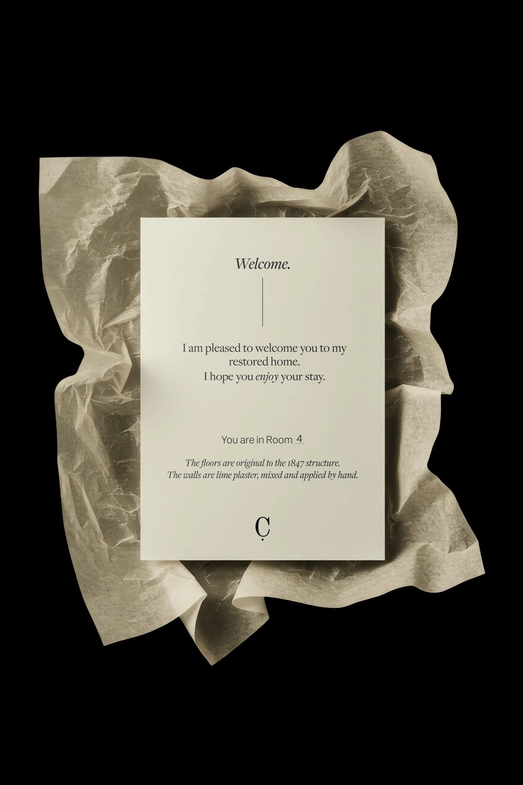
The stationery suite — letterhead, envelope, notecard, guest welcome card — was designed to the same standard as the renovation: nothing applied, nothing performed. The envelope runs full brick. The letterhead lets the mark speak alone at the top. The welcome card tells the guest one true thing about the room they're standing in. Toiletries labels were also designed with the same elegant simplicity that you see in the stationery suite.
Stationery Collateral Design for Rooms
Label Design for Branded Toiletries
Some gardens outlast everything in architecture design.
This one is proof.
The project is successful if an architect who has done adaptive reuse work looks at this and recognizes the same quality of restraint the client brought to the renovation. And it’s not because the design explained the building.
It’s because it understood it.
Working on something similar?