
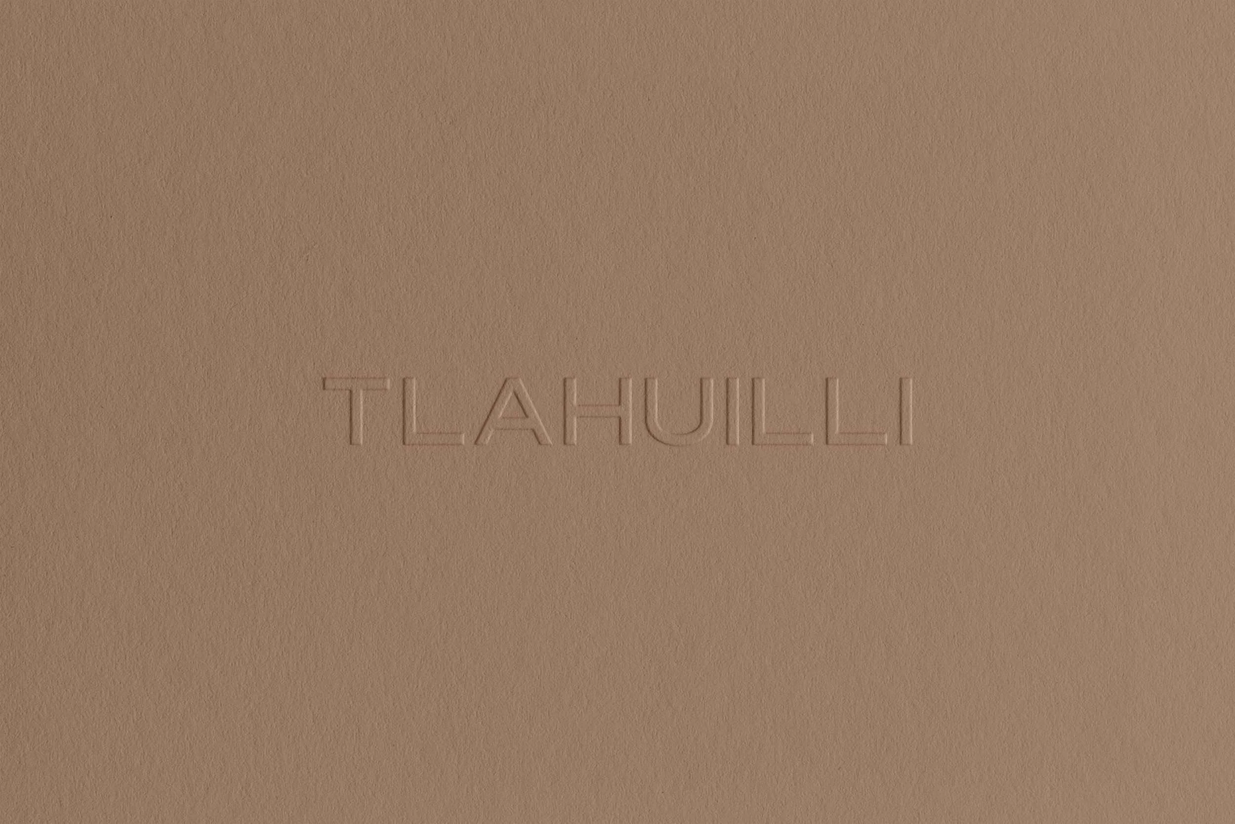
Tlahuilli—Boutique Hotel Branding
Tepoztlán, Morelos, México
PROJECT SCOPE
CLIENT TYPE: CONCEPT
INDUSTRY: BOUTIQUE HOSPITALITY
DELIVERABLES: BRAND IDENTITY, STATIONERY
SUITE, GUEST COLLATERAL
YEAR: 2026
Tlahuilli (tla-weel-lee) sits on a hillside outside Tepoztlán, Morelos, with views toward the Tepozteco range. It has sixteen rooms, a new structure built on vacant land, and has a material palette that consists of concrete, stone, timber, lime plaster, all chosen specifically to recede. Its name comes from the Náhuatl word for the light. There was nothing here before. Now there are sixteen rooms, a hillside, and a view that makes it very difficult to leave.
The founder, Renata Solís Trujillo, spent more time deciding where not to put walls than where to put them. The design problem wasn't how to make a new building feel warm — it was how to earn warmth without borrowing it from history. Nothing here is applied and nothing is performed. Every decision legible as a response to this specific site, this specific light, at this specific hour of the afternoon.
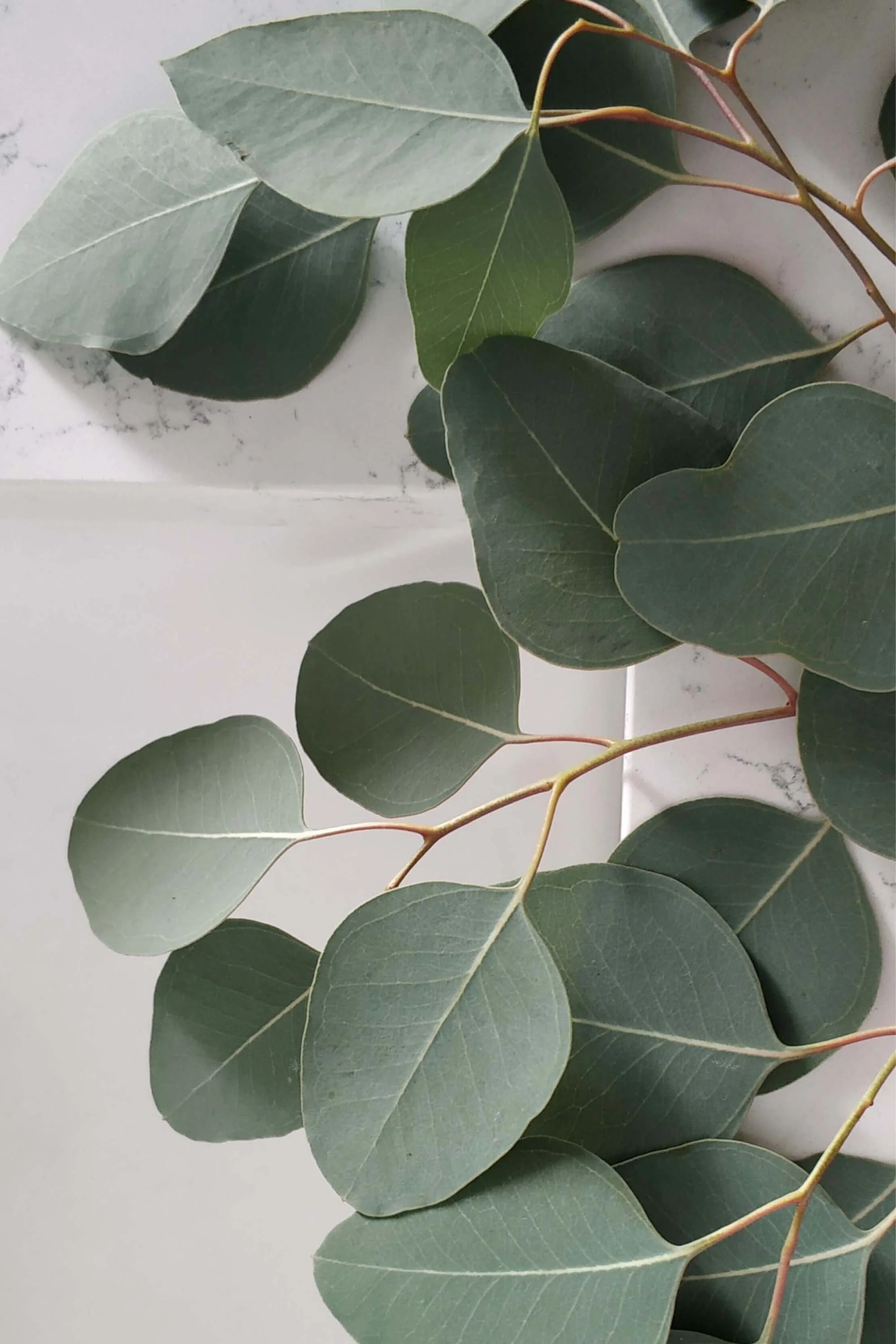
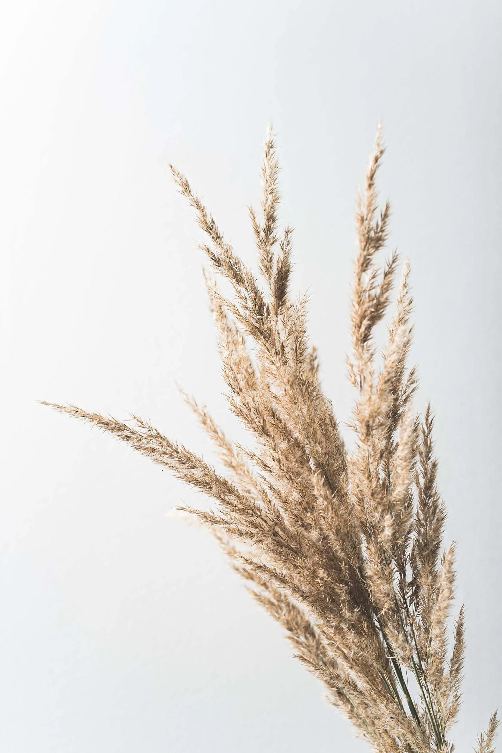
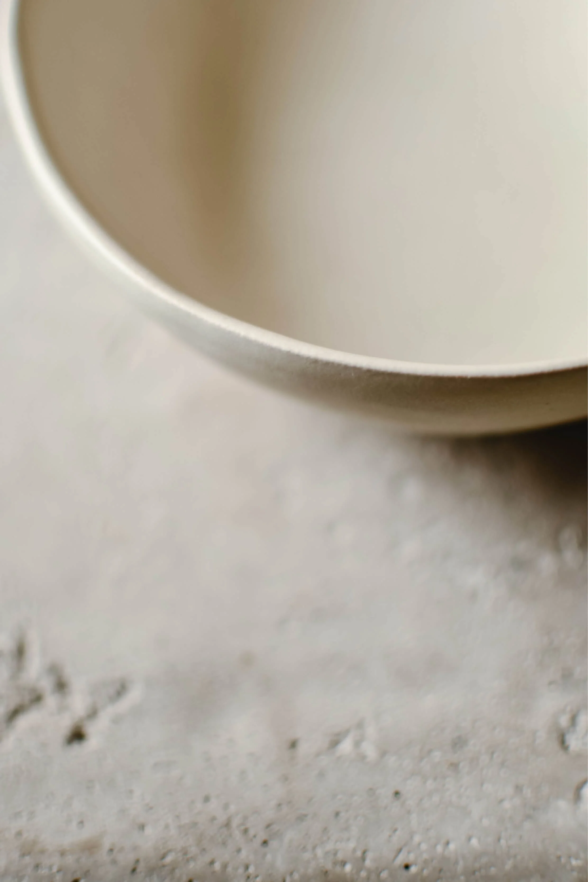
INSPIRATION COLOR PALETTE




THE IDENTITY
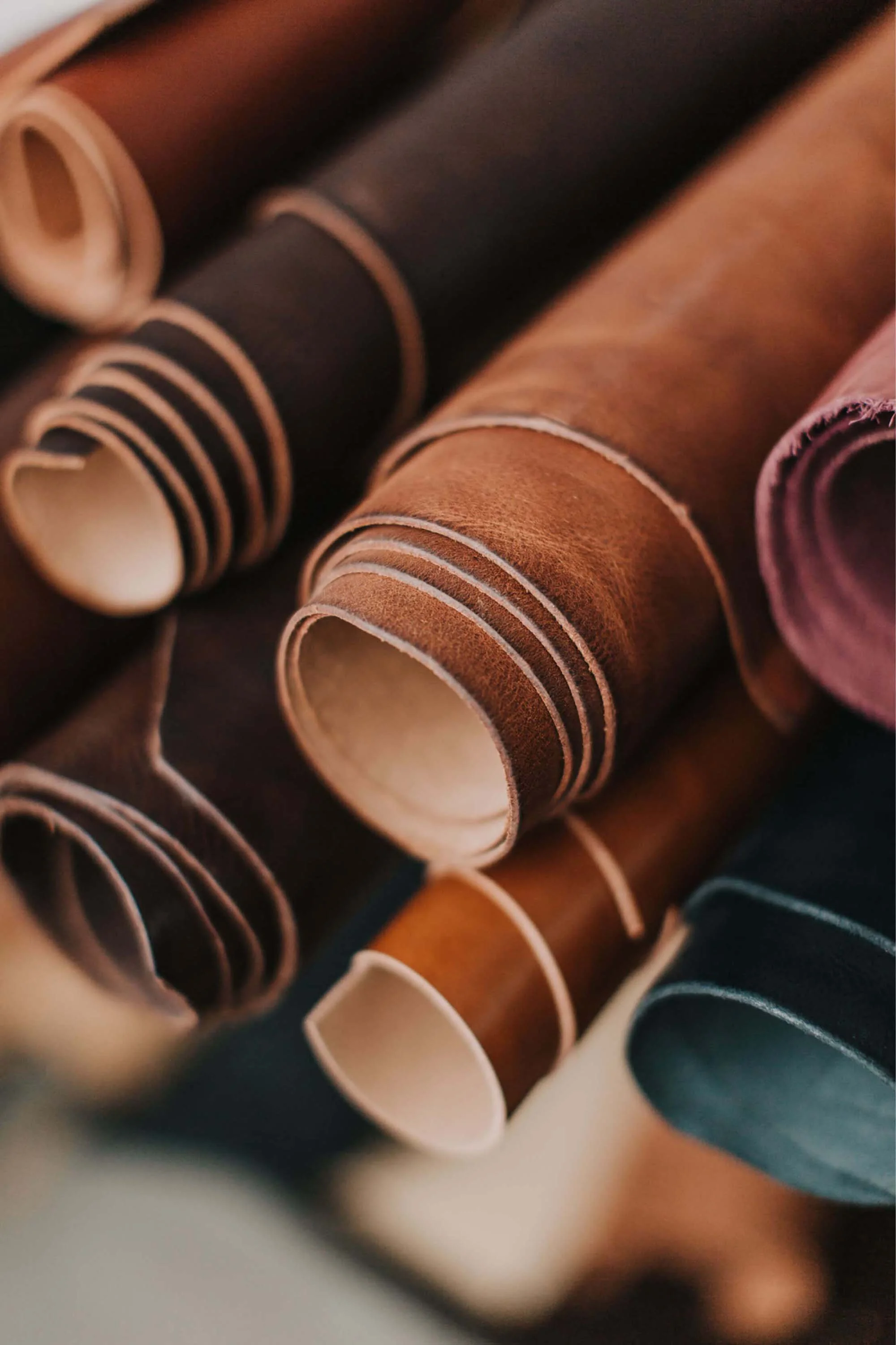
The word tlahuilli is Náhuatl for light —the same light the building was positioned to receive. It is also a constraint: every palette decision, every material choice, every line of copy tested against whether it belongs to this place or was brought in from somewhere else. The palette was pulled from the site's own conditions: warm cream plaster, deep pine shadow, terracotta-adjacent clay at golden hour, near-black stone. No imported warmth. No decorative gesture. The colors of actual materials, in actual light, nothing more.
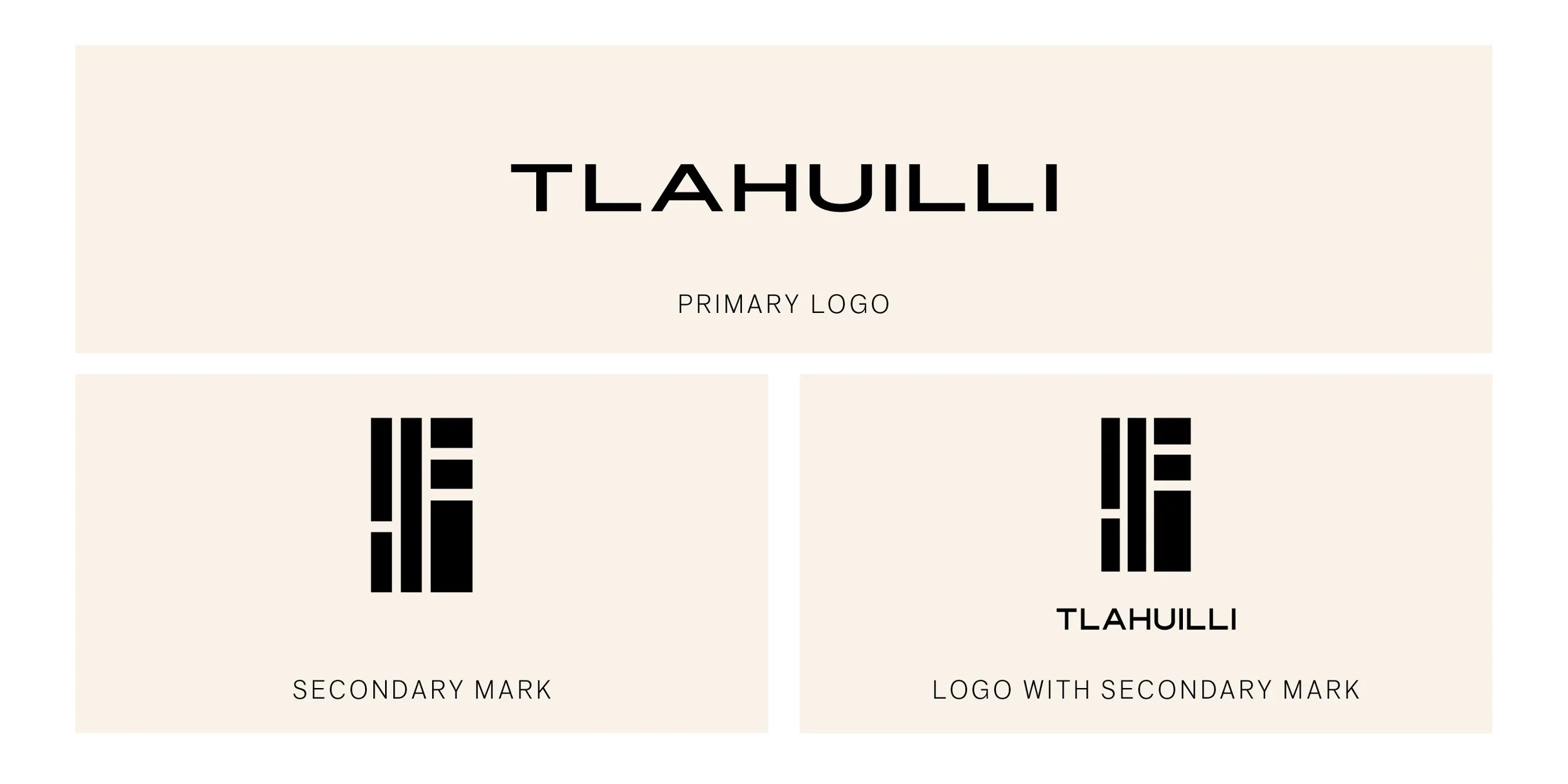
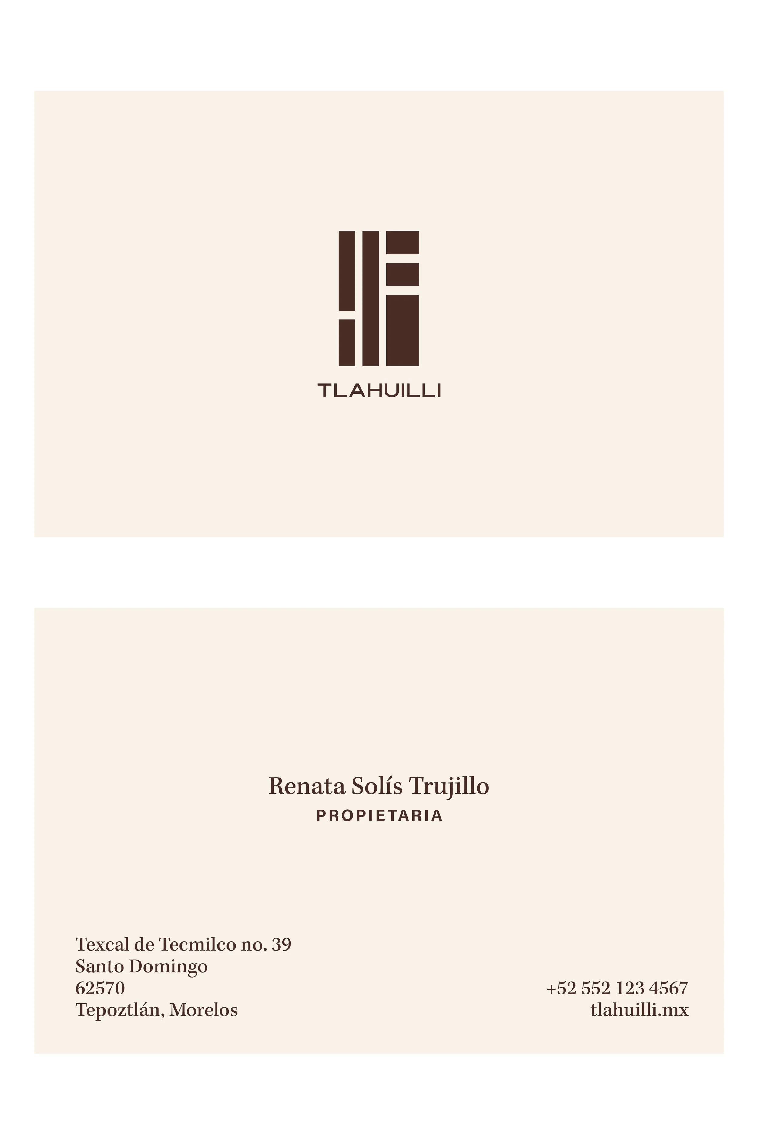
The wordmark is set in Modena Sans, tracked wide in all caps. The choice is straightforward: this is a new building with minimal interiors and clean lines. A sans serif is the honest typographic equivalent of that. The secondary mark is an elevation representing light: three wall sections, three openings, light passing through the gaps. It is not a monogram. It is not a symbol. It is a building condition, reduced to its essential geometry.
THE SYSTEM
Kepler sets the headlines in display weight — a refined serif with enough warmth to sit beside the wordmark without competing with it, and enough precision to stay consistent with the architectural restraint of the system. Acumin Pro handles the working type: neutral, clean, and invisible in the way good body type should be. It also has excellent Spanish diacritic support — non-negotiable for an all-Spanish property.
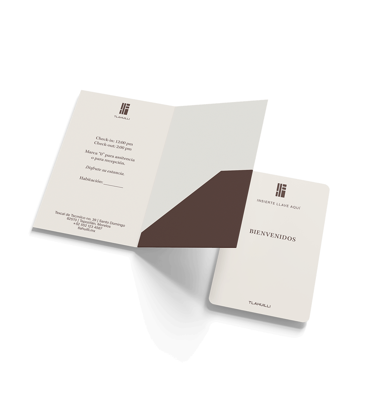
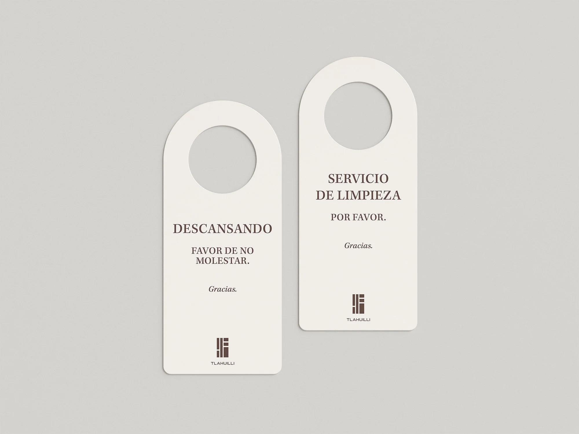
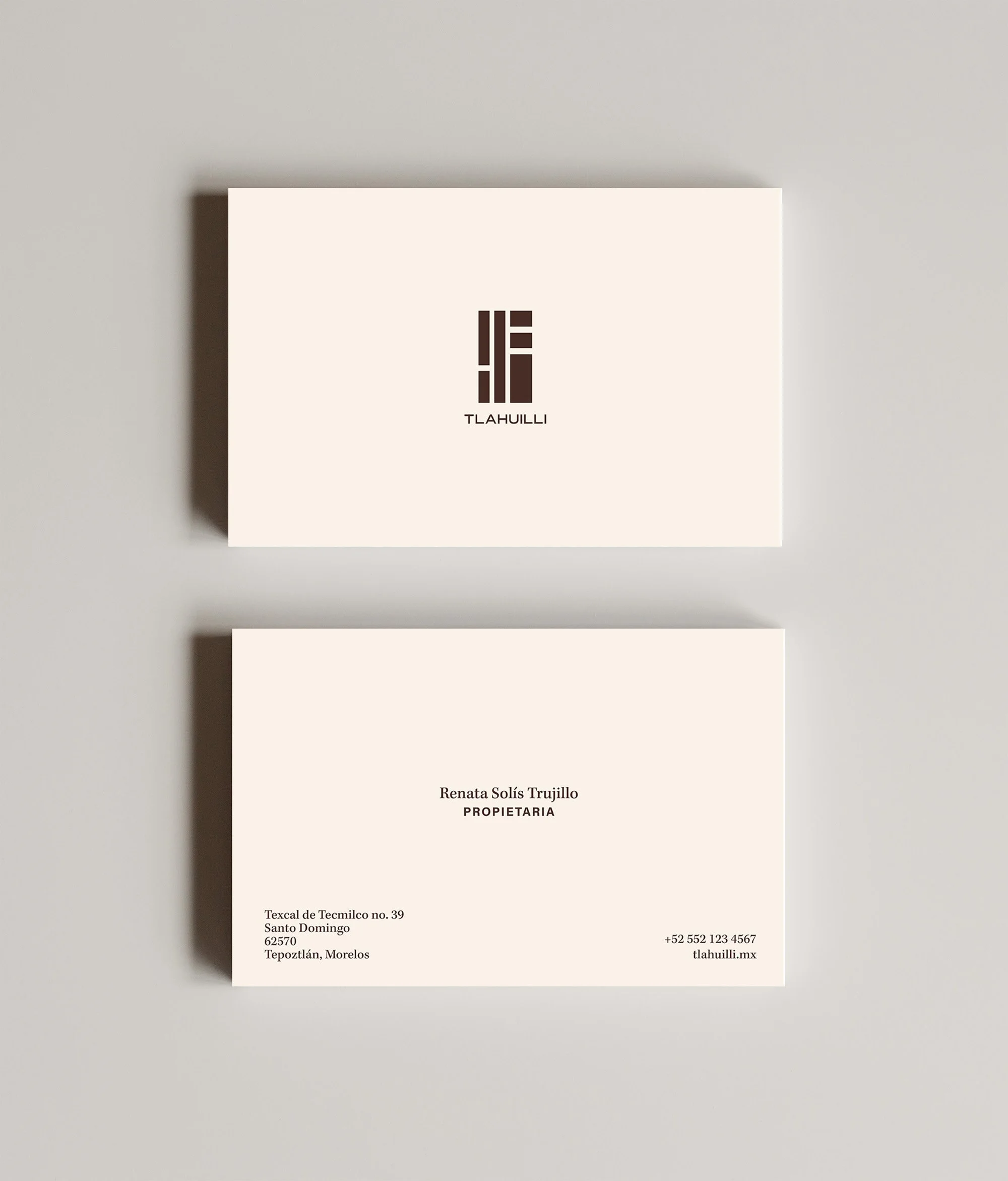
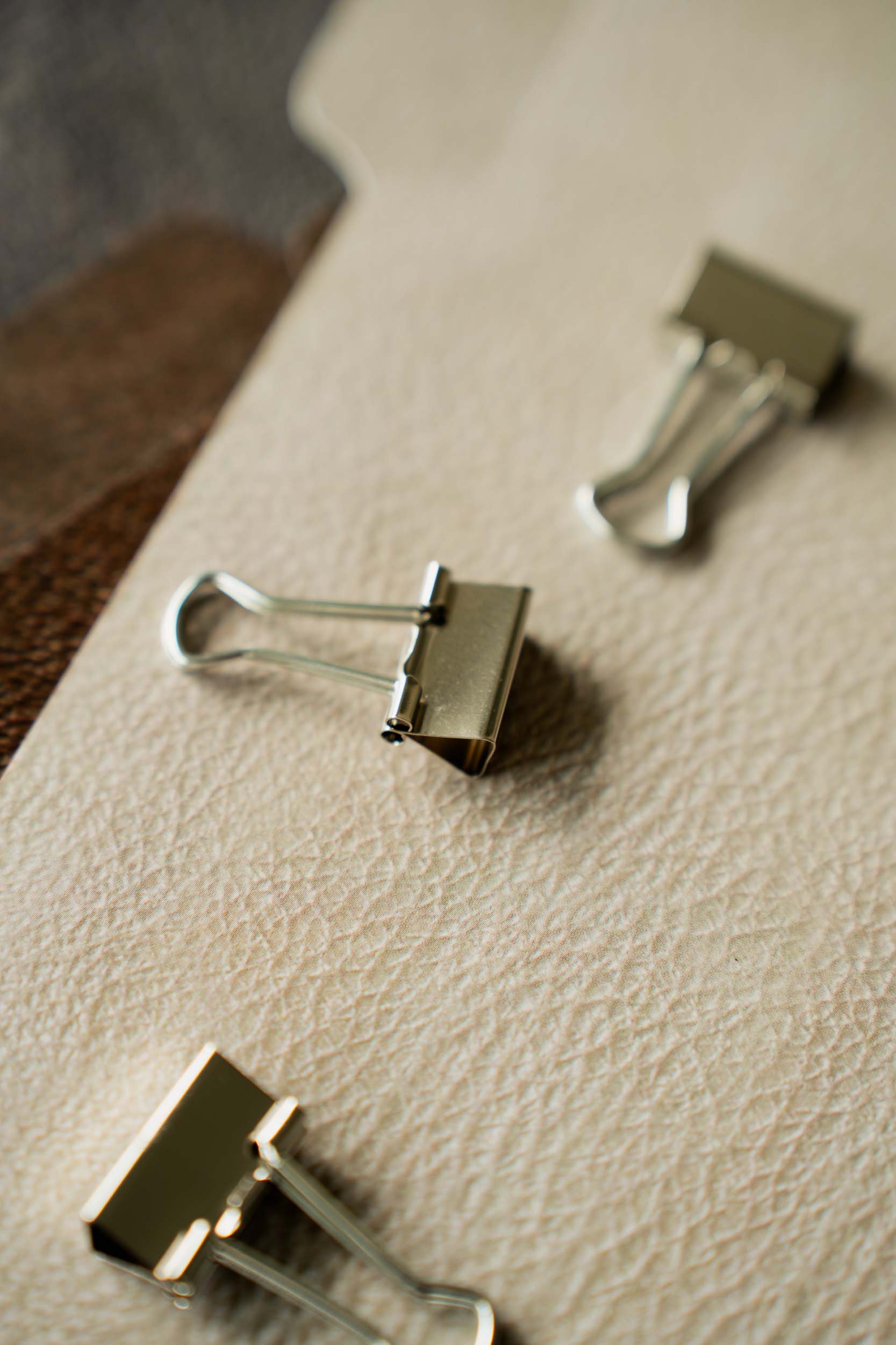
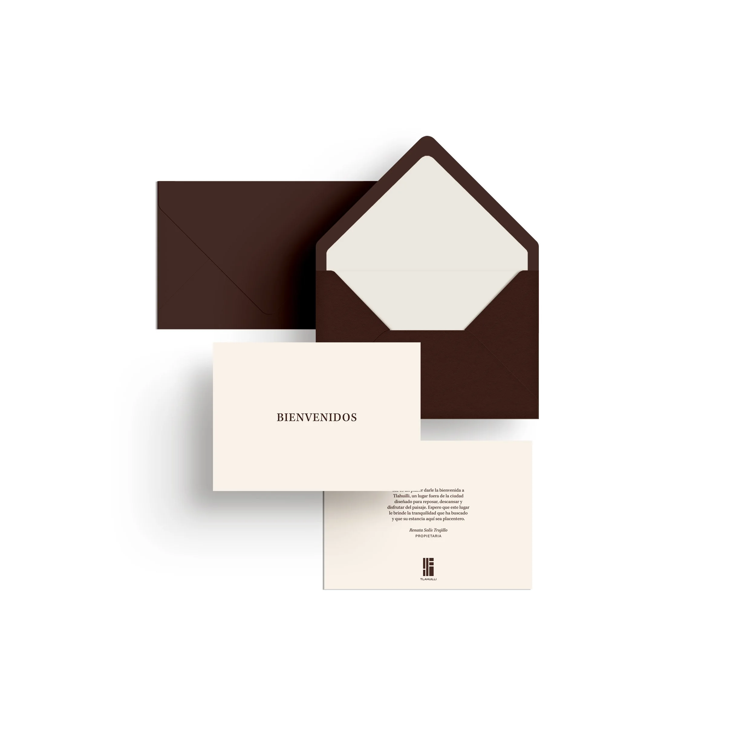
The stationery suite — letterhead, door hanger, room key card, welcome card, notebook, pencil — was designed to the same standard as the building: nothing applied, nothing performed. The door hanger carries one instruction in Spanish. The amenity box and hand soap label use the mark alone. The letterhead lets the wordmark speak at the top and gets out of the way.

Collateral Design
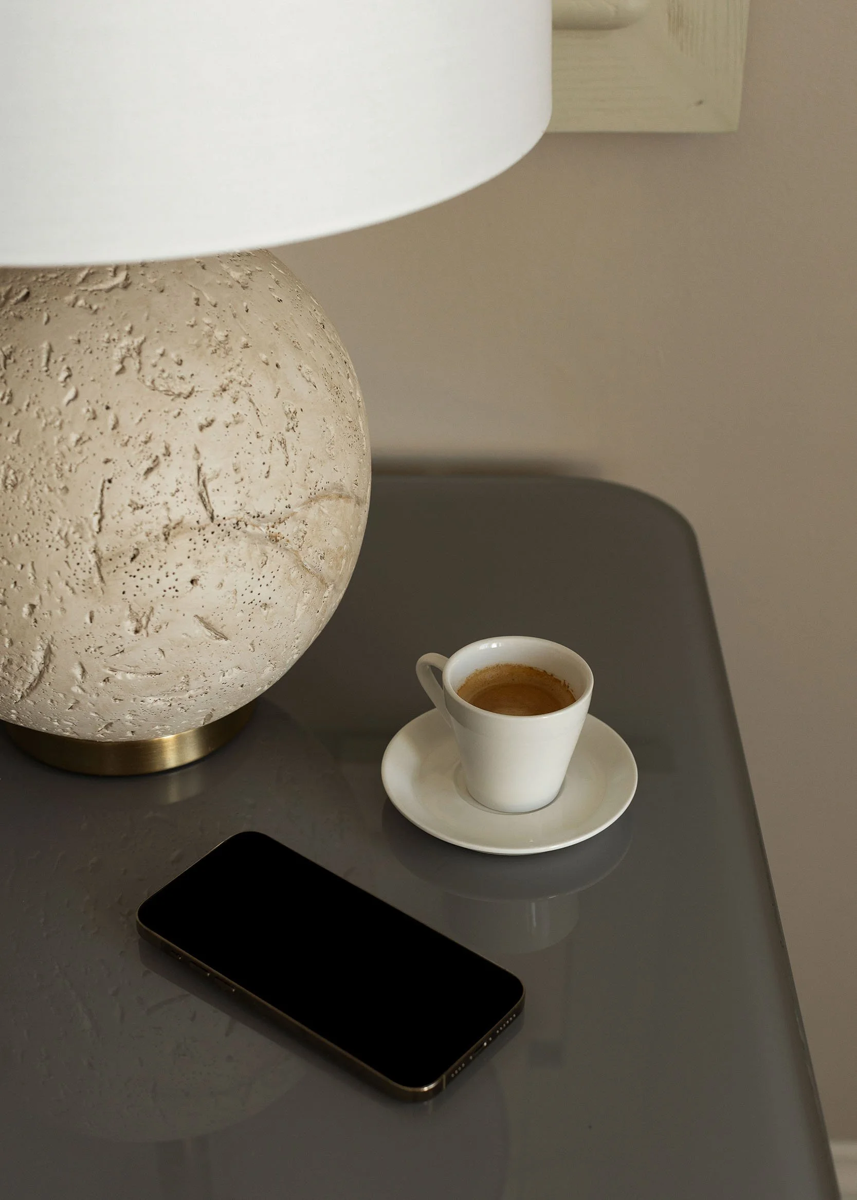
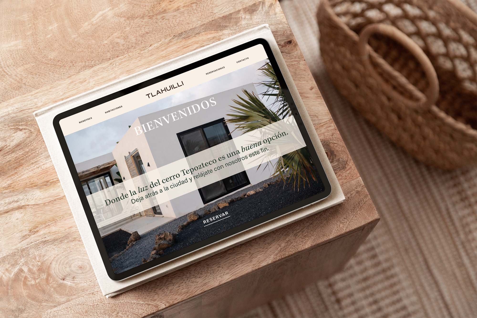
Tlahuilli is a hospitality experience that was built from scratch on a hillside in Morelos, Mexico. Just open rooms, natural light, and the “cerro” outside every window.