
The 3:15 Papers
CLIENT TYPE: REAL CLIENT
INDUSTRY: RELIGIOUS PUBLISHING
DELIVERABLES: FIXED E-PUB DESIGN, TYPOGRAPHY SYSTEM, DIGITAL LAYOUT
YEAR: 2023
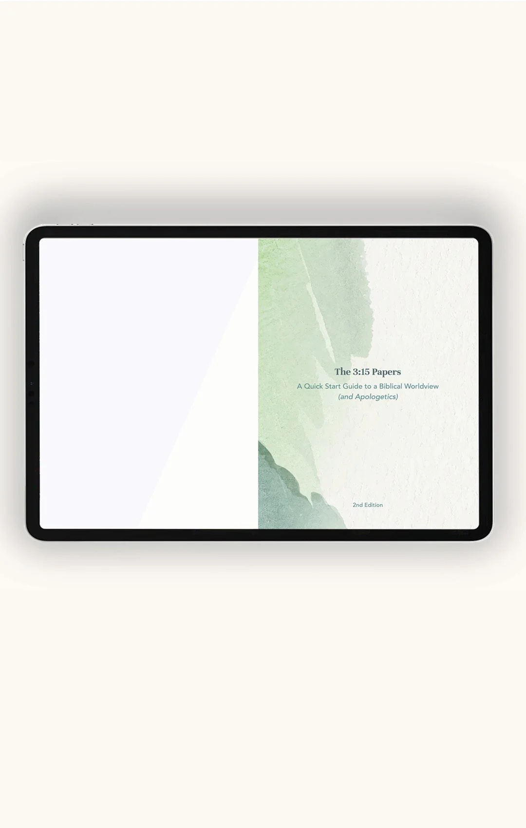
The 3:15 Papers is a fixed EPUB publication designed to make a dense body of theological research — covering biblical worldview and Christian apologetics — accessible and visually engaging for a digital reader. The client had everything written and organized; the design challenge was transforming a heavily structured Word document into something fluid enough to read, without sacrificing the integrity of how content and imagery were meant to work together.


Format decision — A fixed EPUB rather than a reflowable one was a deliberate structural choice: because images were sequenced to correspond with specific passages, a reflowable format would have broken that relationship every time a reader adjusted their font size. Fixed format kept the design intact.
Type system — Screen legibility drove every type decision. Avenir for body copy — clean, open, and designed for digital reading. Unna for titles, subtitles, and pull quotes — enough editorial contrast to create hierarchy without competing with the content.
Color palette — Restrained and intentional. The palette needed to feel modern without drawing attention to itself, keeping the visual weight in service of the message rather than the design.
Navigation system — Clickable internal links and external source references were built into the layout from the start, allowing readers to move through the material freely — the structure of the publication working the same way the content asks its reader to think.