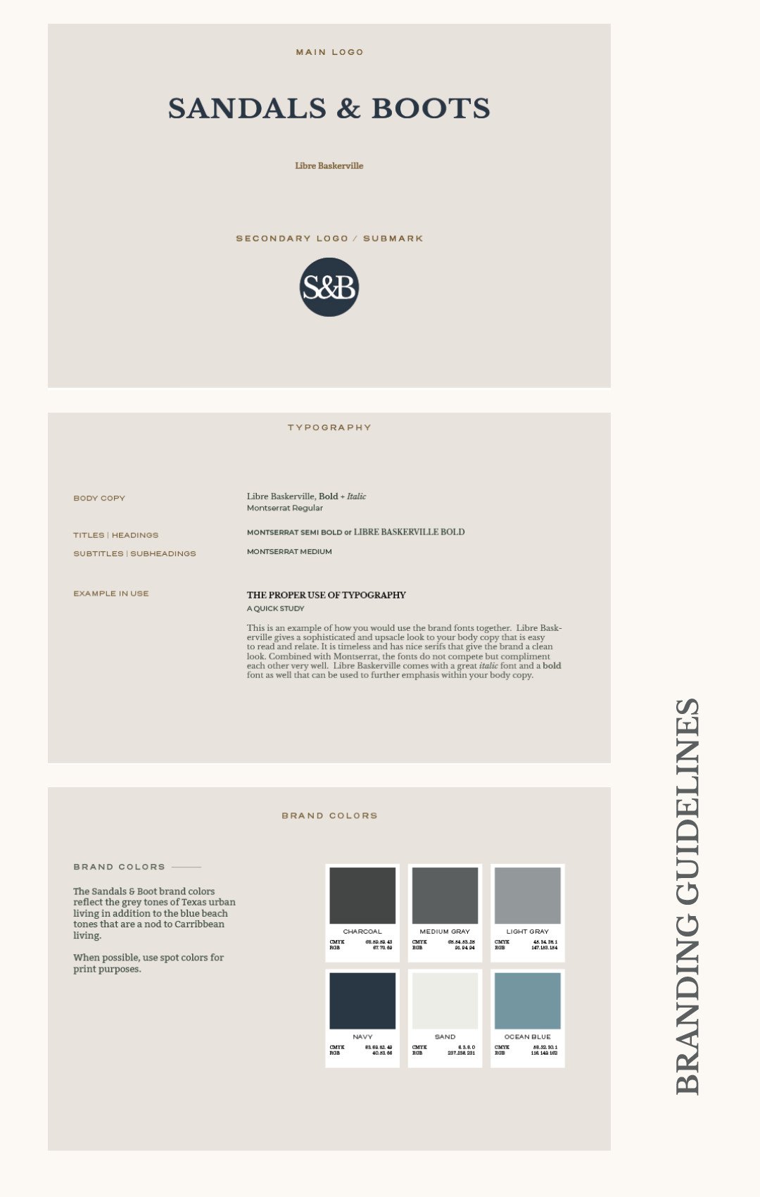
Sandals & Boots
CLIENT TYPE: REAL
INDUSTRY: BRAND IDENTITY + PRODUCT LABEL DESIGN
DELIVERABLES: LOGO SYSTEM, BRAND COLOR PALETTE, TYPOGRAPHY, JAR LABEL DESIGNS
YEAR: 2023
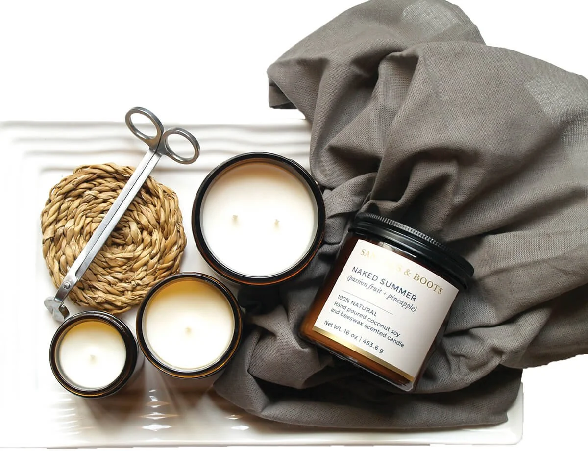
Sandals & Boots is a boutique candle brand built around two distinct lifestyle identities — the breezy, coastal feeling of Caribbean Florida and the upscale, urban living of Texas. The brand name itself is the concept: sandals for the beach, boots for the city. Every candle is hand-poured with all-natural ingredients — coconut soy, beeswax, zero carcinogens — positioning the brand at the intersection of luxury and environmental responsibility.
The client came in with a brand name, a set of scent names, and a clear sense of her two worlds. What she needed was a visual identity system that could hold both — and a label design that could differentiate between them without fracturing the brand.
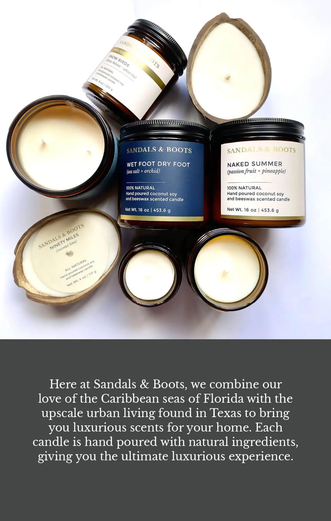


Concept: The dual-identity structure became the organizing principle for everything. Rather than creating one unified label system, scents were sorted into two collections — Sandals (coastal, Caribbean-influenced) and Boots (Texas, grounded, warm) — each with its own color language, while sharing the same typographic system and label architecture to maintain brand cohesion.
Type System: Libre Baskerville carries the brand wordmark and scent names — timeless and elegant without being fussy. Montserrat handles supporting information: weight, ingredients, descriptors. Together they read upscale and clean, letting the scent names do the storytelling without visual noise competing against them.
Color Logic
Sandals collection: ocean-influenced navy and sand tones, evoking Caribbean coastal living
Boots collection: charcoal and warm grey tones grounded in Texas urban sensibility
Both collections share the same label structure, so the color shift signals the collection without breaking the system
Label Architecture All labels follow a consistent hierarchy: brand name → scent name → scent notes in italics → ingredient callout → net weight. This keeps the shopping experience legible and consistent across both collections, and scales cleanly across jar sizes — from the 16 oz amber jars to small travel tins and wax melt clamshells.
Holiday Edition A third label variant was designed for the Holiday Edition wax melts, introducing seasonal color blocking (forest green, blush, gold) while retaining the same typographic hierarchy and brand wordmark — keeping it clearly Sandals & Boots without locking it into either the Sandals or Boots palette.